Pew Research Center

FOR RELEASE MAY 11, 2016

America’s Shrinking Middle Class: A Close Look at Changes Within Metropolitan Areas

The middle class lost ground in nearly nine-in-ten U.S. metropolitan areas examined

FOR MEDIA OR OTHER INQUIRIES:

Communications Department
202.419.4372
www.pewresearch.org

RECOMMENDED CITATION

Pew Research Center, May 2016, "America’s Shrinking Middle Class: A Close Look at Changes Within Metropolitan Areas"

About Pew Research Center

Pew Research Center is a nonpartisan, nonadvocacy fact tank that informs the public about the issues, attitudes and trends shaping the world. It does not take policy positions. The Center conducts public opinion polling, demographic research, computational social science research and other data-driven research. It studies politics and policy; news habits and media; the internet and technology; religion; race and ethnicity; international affairs; social, demographic and economic trends; science; research methodology and data science; and immigration and migration. Pew Research Center is a subsidiary of The Pew Charitable Trusts, its primary funder.

© Pew Research Center 2026

Table of contents

  • About Pew Research Center
  • America’s Shrinking Middle Class: A Close Look at Changes Within Metropolitan Areas
  • 1. The American middle class loses ground nationally
  • 2. The relative size of income tiers and their financial status varied greatly across U.S. metropolitan areas in 2014
  • 3. The middle class shrank and incomes fell in most metropolitan areas from 2000 to 2014
  • Acknowledgments
  • Methodology
  • Appendix A: References
  • Appendix B: Detailed tables and maps

America’s Shrinking Middle Class: A Close Look at Changes Within Metropolitan Areas

The middle class lost ground in nearly nine-in-ten U.S. metropolitan areas examined

The American middle class is losing ground in metropolitan areas across the country, affecting communities from Boston to Seattle and from Dallas to Milwaukee. From 2000 to 2014 the share of adults living in middle-income households fell in 203 of the 229 U.S. metropolitan areas examined in a new Pew Research Center analysis of government data. The decrease in the middle-class share was often substantial, measuring 6 percentage points or more in 53 metropolitan areas, compared with a 4-point drop nationally.

The shrinking of the middle class at the national level, to the point where it may no longer be the economic majority in the U.S., was documented in an earlier analysis by the Pew Research Center. The changes at the metropolitan level, the subject of this in-depth look at the American middle class, demonstrate that the national trend is the result of widespread declines in localities all around the country.

This report encompasses 229 of the 381 “metropolitan statistical areas” as defined by the federal government. That is the maximum number of areas that could be identified in the Census Bureau data used for the analysis and for which data are available for both 2000 and 2014 (an accompanying text box provides more detail). 1 Together, these areas accounted for 76% of the nation’s population in 2014.

With relatively fewer Americans in the middle-income tier, the economic tiers above and below have grown in significance over time. The share of adults in upper-income households increased in 172 of the 229 metropolitan areas, even as the share of adults in lower-income households rose in 160 metropolitan areas from 2000 to 2014. The shifting economic fortunes of localities were not an either/or proposition: Some 108 metropolitan areas experienced growth in both the lower- and upper-income tiers.

The tale of two metropolitan areas: A smaller middle class could signal a move either up or down the income ladder

The possibility that a shrinking of the middle class may signal a movement into either the lower-income tier or the upper-income tier is exemplified by the experiences of Goldsboro, NC, and Midland, TX—one community buffeted by broader economic forces and the other buttressed by them.

In Goldsboro—an old railroad junction town and home to Seymour Johnson Air Force Base—the share of adults who are middle income fell from 60% in 2000 to 48% in 2014, or by 12 percentage points. This was one of the greatest decreases among the 229 metropolitan areas analyzed. It was also an unambiguous signal of economic loss as the share of adults in lower-income households in Goldsboro increased sharply, from 27% in 2000 to 41% in 2014.

But in Midland—an energy-based economy that benefited from the rise in oil prices from 2000 to 2014—the shrinking middle class was a sign of financial gains. The share of adults in middle-income households in Midland decreased from 53% in 2000 to 43% in 2014, the fourth-largest drop in the nation. But this was accompanied by rapid growth in the share of adults in upper-income households in Midland, which doubled from 18% in 2000 to 37% in 2014. 2

Among American adults overall, including those from outside the 229 areas examined in depth, the share living in middle-income households fell from 55% in 2000 to 51% in 2014. Reflecting the accumulation of changes at the metropolitan level, the nationwide share of adults in lower-income households increased from 28% to 29% and the share in upper-income households rose from 17% to 20% during the period. 3

ST_15.11.20_Middle-Income-Calc_Promo_140x140

Are you in the American middle class?

Find out with our income calculator.
Our new calculator lets you find out which group you are in – first compared with other adults in your metropolitan area and among American adults overall, and then compared with other adults in the U.S. similar to you in education, age, race or ethnicity, and marital status.

The widespread erosion of the middle class took place against the backdrop of a decrease in household incomes in most U.S. metropolitan areas. Nationwide, the median income of U.S. households in 2014 stood at 8% less than in 1999, a reminder that the economy has yet to fully recover from the effects of the Great Recession of 2007-09. The decline was pervasive, with median incomes falling in 190 of 229 metropolitan areas examined. Goldsboro ranked near the bottom with a loss of 26% in median income. Midland bucked the prevailing trend with the median income there rising 37% from 1999 to 2014, the greatest increase among the areas examined. 4

The decline of the middle class is a reflection of rising income inequality in the U.S. Generally speaking, middle-class households are more prevalent in metropolitan areas where there is less of a gap between the incomes of households near the top and the bottom ends of the income distribution. Moreover, from 2000 to 2014, the middle-class share decreased more in areas with a greater increase in income inequality.

These findings emerge from a new Pew Research Center analysis of the latest available 2014 American Community Survey (ACS) data from the U.S. Census Bureau in conjunction with the 2000 decennial census data. The focus of the study is on the relative size and economic well-being of the middle class in U.S. metropolitan statistical areas. These areas consist of an urban core and surrounding localities with social and economic ties to the core. A metropolitan area may cross state boundaries, such as the New York-Newark-Jersey City, NY-NJ-PA area (see the text box for more details).

A previous report from the Pew Research Center, released on Dec. 9, 2015, focused on national trends in the size and economic well-being of the American middle class from 1971 to 2015. That report demonstrated that the share of American adults in middle-income households shrank from 61% in 1971 to 50% in 2015. The national level estimates presented in the earlier report were derived from Current Population Survey (CPS) data. Thus, they differ slightly from the estimates in this report.

The current and future status of the American middle class continues to be a central issue in the 2016 presidential campaign. Moreover, new economic research suggests that a struggling middle class could be holding back the potential for future economic growth. 5 The national trend is clear—the middle class is losing ground as a share of the population, and its share of aggregate U.S. household income is also declining. 6 But, as the trends in Goldsboro and Midland demonstrate, similar changes in the size of the middle class could reflect very different economic circumstances and reactions at the local level.

U.S. metropolitan statistical areas

Metropolitan statistical areas represent the country’s urban centers. By definition, they consist of at least one urbanized area with a population of 50,000 or more people, plus neighboring areas that are socially and economically integrated with the core. The geographic building block for a metropolitan area is a county. But metropolitan areas may cross state boundaries, such as the Washington-Arlington-Alexandria, DC-VA-MD-WV area.

The federal government, via the Office of Management and Budget (OMB), identifies 381 metropolitan areas in the U.S. These 381 areas encompass 1,167 of the 3,143 counties in the U.S. About 85% of the U.S. population lives in metropolitan areas; the remainder lives either in smaller urban areas or in rural areas (see http://www.census.gov/population/metro/ and https://www.whitehouse.gov/sites/default/files/omb/bulletins/2013/b-13-01.pdf for more details).

Unfortunately, metropolitan areas are not specifically identified in the datasets the U.S. Census Bureau releases for public use. Instead, metropolitan areas must be reconstructed, or approximated, using another geographic identifier—the public-use microdata area (PUMA). By this method, the Integrated Public Use Microdata Series (IPUMS) version of the 2014 American Community Survey—the source data for this report—is able to identify a total of 260 metropolitan areas. These are not always precise replications of the areas defined by OMB because PUMAs occasionally straddle official metropolitan area boundaries (see the description of the variable MET2013 at https://usa.ipums.org/usa-action/variables/alphabetical?id=M).

Another limitation of the data is that the definitions for metropolitan areas are changed frequently. The latest OMB definitions were released in 2013 and differ from the metropolitan area delineations in 2000. As a result, the 260 areas identified in the 2014 American Community Survey could be matched to only 229 areas in the public-use version of the 2000 decennial census. These 229 areas, accounting for 76% of the U.S. population in 2014, comprise the sample of metropolitan areas for this report.

Who is middle income?

Who is 'middle income' and 'upper income' in 2014?

In this report, “middle-income” Americans are defined as adults whose annual household income is two-thirds to double the national median, after incomes have been adjusted for household size. 7 In 2014, the national middle-income range was about $42,000 to $125,000 annually for a household of three. Lower-income households have incomes less than 67% of the median and upper-income households have incomes that are more than double the median.

The income it takes to be middle income varies by household size, with smaller households requiring less to support the same lifestyle as larger households. Thus, a one-person household needed only $24,000 to $72,000 to be middle income in 2014. But a five-person household had to have an income ranging from $54,000 to $161,000 to be considered middle income.

Middle income or middle class?

The terms “middle income” and “middle class” are often used interchangeably. This is especially true among economists who typically define the middle class in terms of income or consumption. But being middle class can connote more than income, be it a college education, white-collar work, economic security, homeownership, or having certain social and political values. Class could also be a state of mind, that is, it could be a matter of self-identification (Pew Research Center, 2008, 2012). The interplay among these many factors is examined in studies by Hout (2007) and Savage et al. (2013), among others.

This report uses household income to group people. For that reason, the term “middle income” is used more often than not. However, “middle class” is also used at times for the sake of exposition.

The same middle-income standard is used to determine the economic status of households in all metropolitan areas after their incomes have been adjusted for the cost of living in the area. That means the incomes of households in relatively expensive areas, such as New York-Newark-Jersey City, NY-NJ-PA, are adjusted downward, and the incomes of households in relatively cheaper areas, such as McAllen-Edinburg-Mission, TX, are adjusted upward. Incomes are also adjusted for increases in the prices of goods and services over time when analyzing changes in the status of households from 2000 to 2014. 8

Metropolitan areas with the largest middle-, lower- and upper-income tiers in 2014

A distinct geographical pattern emerges with respect to which metropolitan areas had the highest shares of adults who were lower income, middle income or upper income in 2014. The 10 metropolitan areas with the greatest shares of middle-income adults are located mostly in the Midwest. Wausau, WI, where 67% of adults lived in middle-income households in 2014, had the distinction of leading the country on this basis, followed closely by Janesville-Beloit, WI (65%). Sheboygan, WI, and four other Midwest areas also placed among the top 10 middle-income areas.

Beyond a shared geography, the top 10 middle-income metropolitan areas are more rooted in manufacturing than the nation overall. Elkhart-Goshen, IN, for example, derived 56% of its gross domestic product (GDP) in 2014 from the manufacturing sector alone. Likewise, the manufacturing sector’s share was 40% in Sheboygan, WI, and more than 20% in Wausau, WI, Lebanon, PA, Ogden-Clearfield, UT, and Kankakee, IL. Overall, manufacturing accounted for only 12% of the nation’s GDP in 2014. 9

But the role of the manufacturing sector in sustaining the middle class in these Midwest localities is not clear-cut. While manufacturing jobs tend to pay more than average, the sector has been letting go of workers in recent decades. 10 Nationwide, employment in the manufacturing sector shrank 29% from 2000 to 2014. 11 The middle-class communities in the Midwest were not immune to this trend.

Metropolitan areas with the highest shares of middle-income adults in 2014 are mostly in the Midwest

Among the Midwestern areas with some of the highest shares of adults who are middle income, the areas hardest hit by the loss in manufacturing jobs were Janesville-Beloit, WI, where manufacturing employment fell 49% from 2000 to 2014, and Youngstown-Warren-Boardman, OH-PA, where it fell 42%. Although at least 6-in-10 adults were middle class in these areas in 2014, both localities experienced losses in the shares of adults who were upper income and increases in the share who were lower income from 2000 to 2014. Thus, the economic status of the middle class in some of the Midwestern localities is not necessarily on firm ground.

The remaining top 10 middle-income metropolitan areas experienced more modest losses in manufacturing jobs and other sectors stepped in to pick up the slack in several areas. For example, from 2000 to 2014, Wausau, WI, lost 3,200 manufacturing jobs but overall private sector employment increased by nearly 1,ooo. Similarly, Eau Claire, WI, had a loss of 2,300 manufacturing jobs but an overall gain of 5,700 private sector jobs. Neither of these two areas experienced much of a change in the shares of adults who were lower income, and Eau Claire witnessed a rise in the share who were upper income. Thus, at least some of these industrial communities held on to their economic standing or saw it improve despite the decay in manufacturing.

Metropolitan areas with the largest upper-income populations are mostly in the Northeast or on the California coast. Midland, TX, the exception to this rule, leads the metropolitan ranking of upper-income areas. Some 37% of the adult population in Midland was upper income in 2014, thanks to a prospering oil economy. High-tech corridors, such as Boston-Cambridge-Newton, MA-NH, and San Jose-Sunnyvale-Santa Clara, CA, are on this list, along with financial and commercial centers, such as Hartford-West Hartford-East Hartford, CT. The adult populations in most of these upper-income areas are also more likely to have a college degree than in the nation overall.

The 10 metropolitan areas with the biggest lower-income tiers are toward the Southwest, several on the southern border. Two metropolitan areas in Texas, Laredo and Brownsville-Harlingen, lead the country in this respect—in both areas 47% of the adult population lived in lower-income households in 2014. Farming communities in central California, namely Visalia-Porterville, Fresno and Merced, are also in this group of lower-income areas. With the exception of Lake Havasu City-Kingman, AZ, Hispanics accounted for more than half of the population in each of these lower-income metropolitan areas in 2014, compared with 17% nationally.

Looking across the broader swath of metropolitan areas, the share of adults who are middle income ranged from a low of 42% in Monroe, LA, to a high of 67% in Wausau, WI, in 2014. But in the majority of metropolitan areas—118 of the 229 examined—the share of adults who were middle income fell within a relatively narrow range of 50% up to 55%. These metropolitan areas are dispersed across the country, not displaying a clear geographical pattern.

In about a quarter of the metropolitan areas in 2014, middle-class adults do not constitute a clear majority of the adult population. Notably, many of the nation’s largest metropolitan areas fall into this group, including Los Angeles-Long Beach-Anaheim, CA, where 47% of adults were middle income; San Francisco-Oakland-Hayward, CA (48%); New York-Newark-Jersey City, NY-NJ-PA (48%); Boston-Cambridge-Newton, MA-NH (49%); and Houston-The Woodlands-Sugar Land, TX (49%).

In some of these metropolitan areas, such as the Boston and San Francisco regions, the relatively small share of the middle-income tier reflects the fact that the upper-income tier is larger than average. But in the Los Angeles region, the middle class is relatively small because the share of adults who are lower income is greater than average.

Perhaps unsurprisingly, the relative size of the lower-income or upper-income tier in a metropolitan area is correlated with the median income of households overall in the area. In Laredo, TX, the area with the largest lower-income tier, the median household income was 35% less than the national median income in 2014. In Midland, TX, the metropolitan area with the largest upper-income tier, the median income was 45% greater than the national median. 12

The extent of income inequality in a metropolitan area also matters. Middle-income adults account for a larger share of the adult population in metropolitan areas where there is less of a difference between the incomes of the highest-earning and lowest-earning households. Wausau, WI, Janesville-Beloit, WI, and Sheboygan, WI, the three areas with the largest middle classes, are also among the metropolitan areas that had the lowest levels of income inequality in 2014.

Changes in the economic status of metropolitan areas from 2000 to 2014

As the middle of the income distribution hollowed around the country from 2000 to 2014, the movement was more up the economic ladder than down the ladder in some metropolitan areas (winners) while in other areas there was relatively more movement down the ladder (losers).

Nationally, the share of adults in the upper-income tier increased from 17% in 2000 to 20% in 2014, a gain of 2 percentage points. 13 Meanwhile, the share of adults in the lower-income tier increased from 28% to 29%, an increase of 1 percentage point. The difference—1 percentage point—is the net gain for American adults. By this measure, the net gain in economic status varied considerably across metropolitan areas. 14

The 10 metropolitan areas that gained or lost the most in economic status from 2000 to 2014

The metropolitan areas that experienced the largest gain in economic status from 200o to 2014 are Odessa and Midland, neighboring communities in Texas with energy-based economies. The other major winners among metropolitan areas are varied in nature. New Orleans-Metairie, LA, and Baton Rouge, LA, are relatively prominent in shipping and petrochemicals, but Lafayette, LA, has more of a stake in information technology. Amarillo, TX, is principally a meat packing economy, while Barnstable Town, MA, is a leading tourist destination on Cape Cod.

The areas with the largest gains in economic status are not necessarily areas with high shares of upper-income households. Indeed, several are decidedly average, with the shares of lower-, middle- and upper-income populations closely resembling the national distribution in 2014. In Grand Junction, CO, for example, some 52% of the adult population was middle income in 2014, 28% was lower income and 20% was upper income. But Grand Junction got to the national norm by nearly doubling the share of its upper-income population from 2000 to 2014, making it one of the big winners.

Although other factors may also be at work, the 10 metropolitan areas with the greatest losses in economic status from 2000 to 2014 have one thing in common—a greater than average reliance on manufacturing. 15 Most of these areas, such as Springfield, OH, and Detroit-Warren-Dearborn, MI, are in the so-called Rust Belt. The areas not in the Rust Belt, such as Rocky Mount, NC, and Hickory-Lenoir-Morganton, NC, are also industrial communities.

These areas generally experienced a significant drop in manufacturing employment from 2000 to 2014, ranging from 23% in Fort Wayne, IN, to 51% in Hickory-Lenoir-Morganton, NC, compared with 29% nationally. The jobs lost in manufacturing were not entirely picked up elsewhere as overall private sector employment also fell from 2000 to 2014 in these 10 metropolitan areas, ranging from a decrease of 3% in Goldsboro, NC, to a decrease of 25% in Hickory-Lenoir-Morganton, NC. In contrast, private sector employment in the U.S. overall increased 5% from 2000 to 2014. 16

Across the 229 metropolitan areas analyzed, 119 were winners, moving up in economic status from 2000 to 2014, and 110 were losers. Changes in median household income are related to the likelihood that a metropolitan area proved to be a winner or a loser. Areas with higher growth in median household income from 1999 to 2014 were more likely to experience an increase in the share of adults who are upper income and a decrease in the share who are lower income. Trends in income inequality also made a difference. Areas with more of an increase in income inequality from 1999 to 2014 experienced larger losses in the middle-class share.

Households experience financial setbacks in most metropolitan areas

American households in all income tiers experienced a decline in their incomes from 1999 to 2014. Nationally, the median income of middle-income households decreased from $77,898 in 1999 to $72,919 in 2014, a loss of 6%. The median incomes of lower-income and upper-income households fell by 10% and 7%, respectively, over this period.

The decline in household incomes at the national level reflected nearly universal losses across U.S. metropolitan areas. Middle-income households lost ground financially in 222 of 229 metropolitan areas from 1999 to 2014. Meanwhile, the median income of lower-income households slipped in 221 metropolitan areas and the median for upper-income households fell in 215 areas.

Median incomes of the middle class and other tiers fell from 1999 to 2014

The trends in income point to economic pressures on the middle class, including in areas where it still holds a large share of the population. In Sheboygan, WI, where 63% of adults are middle class, the median income of the middle class fell by 17%, from $80,281 in 1999 to $66,719 in 2014. Also, middle-income households in areas such as Janesville-Beloit and Eau Claire in Wisconsin and Elkhart-Goshen in Indiana experienced at least a 10% decrease in median incomes. Thus, while these communities are still largely middle class, the financial security of middle-class households in them has deteriorated since 1999.

Looking across metropolitan areas in 2014, there is considerable variation in the median income of households. For households overall, the median income ranged from $39,752 in McAllen-Edinburg-Mission, TX, to $90,743 in Midland, TX. Also, the incomes of households within each income tier varied across metropolitan areas. Among middle-class households, the median income ranged from $64,549 in Hanford-Corcoran, CA, to $81,283 in Racine, WI, a gap of 26%. 17

Road map to the report

This report divides households in U.S. metropolitan areas into three income tiers—lower income, middle income and upper income—depending on how their incomes compare with the national median household income. Household incomes within each metropolitan area are first adjusted for the cost of living in the area relative to the national average cost of living. Incomes are also adjusted for household size and scaled to reflect a household size of three.

In drawing comparisons over time, households that were in the lower-, middle- or upper-income tier in 2014 are compared with households in those tiers in 2000. The analysis does not follow the same households over time, and some households that were middle income in 2000 may have moved to a different tier in 2014. The demographic composition of each income tier may also have changed over the period.

The first chapter of the report describes how the U.S. adult population was distributed across the three income tiers in 2000 to 2014. It also describes the impact of adjusting incomes in metropolitan areas for the local cost of living.

The report then focuses on the size and economic well-being of lower-, middle- and upper-income tiers in U.S. metropolitan areas in 2014, and on how the metropolitan areas compare in these respects. The final chapter analyzes changes in the relative size and well-being of the income tiers from 2000 to 2014 at the metropolitan level.

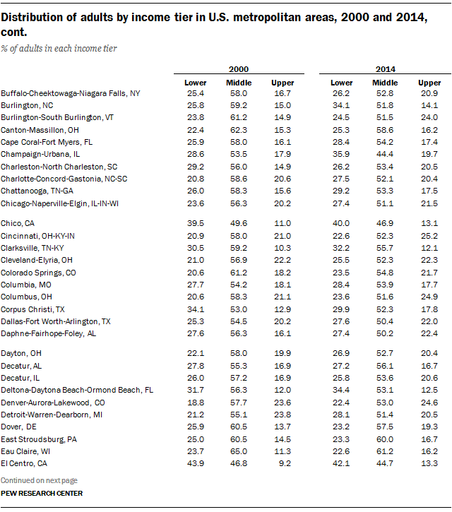
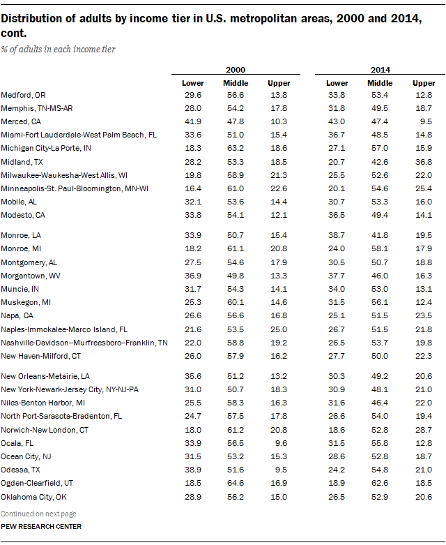
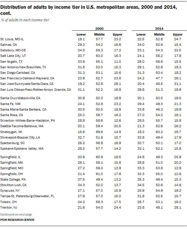
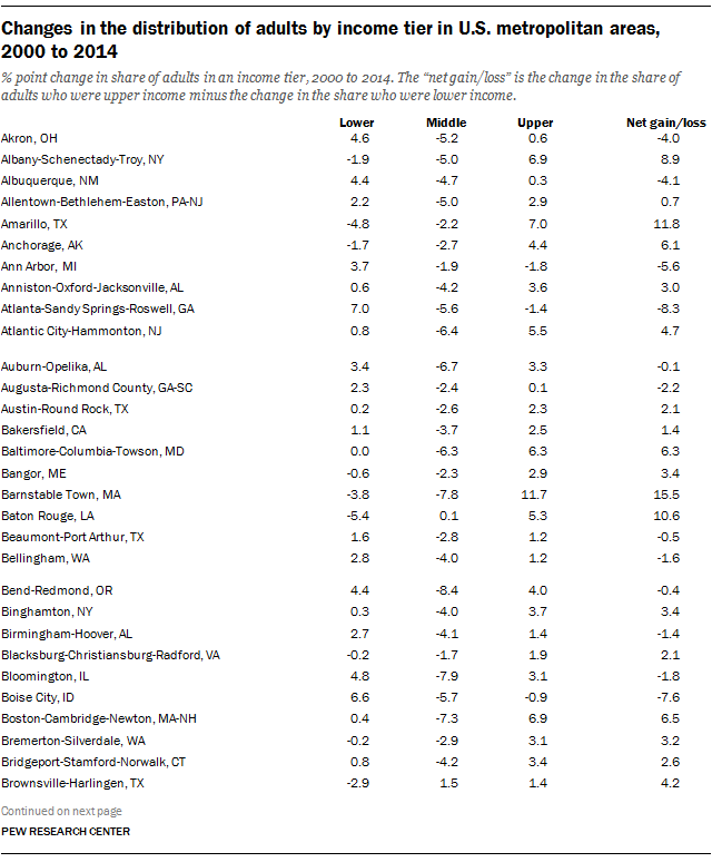
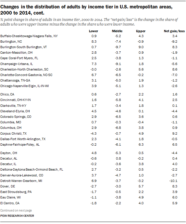
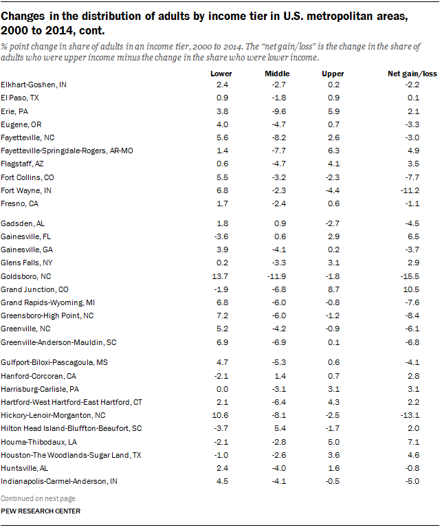
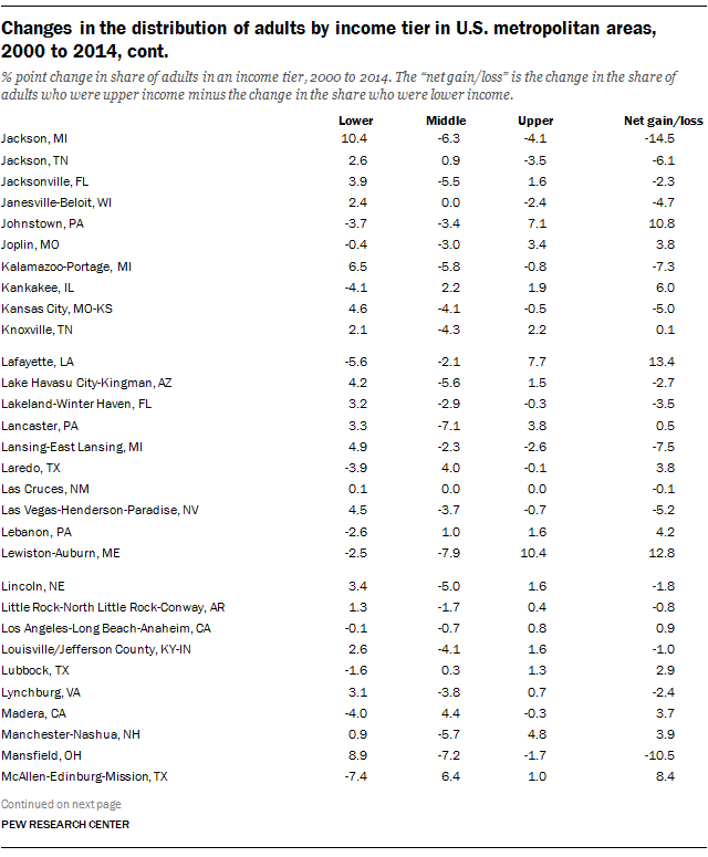
Appendix B contains tables with estimates of the shares of the adult populations in lower-, middle- and upper-income tiers in 229 metropolitan areas and changes in those shares from 2000 to 2014. Maps in Appendix B depict these changes pictorially. Additional data on all metropolitan areas, such as median incomes, cost of living and other economic and demographic indicators, are available online for download.

Terminology and Methodology

“Middle-income” households are defined as those with an income that is two-thirds to double that
of the U.S. median household income, after incomes have been adjusted for household size. For a
three-person household, the middle-income range was about $42,000 to $125,000 annually in
2014 (in 2013-14 dollars). Lower-income households have incomes lower than two-thirds of the
median, and upper-income households have incomes that are more than double the median.

Incomes are also adjusted for household size and scaled to reflect a household size of three. Also,
household incomes within each metropolitan area are adjusted for the cost of living in the area
relative to the national average cost of living.

The 2000 decennial census collected income data for 1999, the preceding calendar year. Thus, the
assignment of adults to an income tier in 2000 is based on their household income in 1999.

The analysis encompasses 229 of 381 metropolitan areas in the U.S., as defined by the Office of
Management and Budget (OMB). The 229 metropolitan areas included in this report are the
maximum number of areas that could be identified in the Census Bureau data used for the analysis
and for which data are available for both 2000 and 2014. These 229 areas accounted for 76% of
the U.S. population in 2014. A metropolitan area consists of at least one urbanized area with a
population of 50,000 or more people, plus neighboring areas that are socially and economically
integrated with the core.

National estimates presented in the report encompass the U.S. adult population, including people
outside of the sample of 229 metropolitan areas.

Differences between numbers or percentages are computed before the underlying estimates are
rounded.

1. The American middle class loses ground nationally

The share of the American adult population that lives in middle-income households has fallen since 2000. The trend this century is the continuation of a long-running decline. An earlier analysis by the Pew Research Center, which looked at the period from 1971 to 2015, demonstrated that the middle class in the U.S. has been shrinking steadily for more than four decades. 18

Nationally, the movement out of the middle from 2000 to 2014 has been accompanied by rising shares of adults in both upper-income and lower-income tiers. Notably, however, when looked at as a whole, the share of Americans who are upper income increased more than the share that are lower income. But, as shown in later chapters, this is not a pattern that describes the experience of all metropolitan areas—in almost half the areas examined, there has been more movement down the ladder than up.

These findings emerge from a new Pew Research Center analysis of data from the 2000 decennial census and the 2014 American Community Survey (ACS), both conducted by the U.S. Census Bureau. 19 Adults are classified as lower, middle or upper income based on their household income adjusted for the number of people in their household. Additionally, incomes are adjusted for the cost of living in a metropolitan area relative to the country overall. The analysis covers 229 of 381 metropolitan areas in the U.S. accounting for 76% of the national population in 2014.

With the recession, the value of a ‘middle-class income’ diminished from 1999 to 2014

Middle-income households are defined as those with an income that is two-thirds to double that of the overall median household income, after having been adjusted for household size. Lower-income households have incomes less than two-thirds of the median, and upper-income households have incomes that are more than double the median. 20

Because the median household income in the U.S. has fallen since 1999, the minimum amount it takes to be middle income has also fallen. Specifically, the median household income in the U.S. decreased from $67,673 in 1999 to $62,462 in 2014, after adjusting for household size and scaling to a household of three. Thus, the minimum income needed to be a middle-income household fell from $45,115 in 1999 to $41,641 in 2014. 21

The top end of the middle-income range also decreased, from $135,346 in 1999 to $124,924 in 2014. The downward trend in what it means to be middle income is the result of the 2001 recession and the Great Recession of 2007-09, and the slow economic recoveries after each.

A smaller share of adults are middle income

Share of American adults living in middle-income households has fallen

Notwithstanding the lowering of the threshold to be defined as middle income, the share of American adults in middle-income households also decreased, from 55% in 2000 to 51% in 2014. At the same time, the share of adults in the upper-income tier increased from 17% to 20%. The share of adults in the lower-income tier also increased, from 28% to 29%. Thus, the distribution of adults by their household income has hollowed in the middle in this century.

The shrinking in the middle is more pronounced over the long haul. As previously reported by Pew Research, the middle-income share decreased from 61% in 1971 to 50% in 2015. Over this nearly 45-year period, the share of the upper-income tier rose from 14% to 21%, and the share in the lower-income tier increased from 25% to 29%. 22

Adjusting incomes for the cost of living in a metropolitan area

The national middle-income standard defined previously—$41,641 to $124,924 for a three-person household in 2014—is also used to determine the economic status of households in all metropolitan areas. However, because the prices of goods and services in a metropolitan area are typically different from the prices nationally, it is necessary to adjust household incomes in each area for that difference in the cost of living. By this process, the incomes of households in relatively expensive areas are adjusted downward and the incomes of households in relatively cheaper areas are adjusted upward.

In this report, the metropolitan area cost-of-living adjustment is based on price indexes published by the U.S. Bureau of Economic Analysis (BEA). These indexes, known as Regional Price Parities, compare the prices of goods and services in a metropolitan area with the national average prices for the same goods and services. The latest available estimates for these indexes are for 2013 (details on Regional Price Parities are available at http://www.bea.gov/regional/index.htm).

The BEA’s Regional Price Parities show a wide range in the cost of living across metropolitan areas. Among the 229 areas covered in this report, the area with the lowest cost of living was Jackson, TN, with a price level that was 17% less than the national average. Urban Honolulu, HI, was one of the most expensive areas, with a cost of living about 22.5% greater than the national average.

Since Jackson is relatively inexpensive, households in that area need to receive an income of only about $34,600, or 17% less than the national standard of $41,641, to be considered a part of the American middle class. But a household in Urban Honolulu needs an income of about $51,000, or 22.5% more than the U.S. norm, to be considered middle class.

Once incomes of households in all metropolitan areas have been adjusted for cost-of-living differences and household size, they are assigned to the lower-, middle- or upper-income tier using the common national standard defined previously. Accounting for the cost of living naturally has an impact on the estimated distribution of adults by income tier. In Jackson, the share of adults who are upper income in 2014 increases from 8% before the cost-of-living adjustment to 15% after the adjustment. In Urban Honolulu, the share of adults who are upper income falls from 27% to 15% after accounting for the cost of living, and the shares who are lower income and middle income rise.

2. The relative size of income tiers and their financial status varied greatly across U.S. metropolitan areas in 2014

The share of adults who lived in lower-, middle- or upper-income households varied markedly across U.S. metropolitan areas in 2014. While 51% of American adults overall were in the middle-income tier in 2014, the share was as low as 42% in Monroe, LA, and as high as 67% in Wausau, WI. Differences in the shares of adults in the lower- and upper-income tiers were even more striking.

Metropolitan areas also differed with respect to the economic well-being of their household residents. The overall median household income was highest in Midland, TX, standing at $90,743 in 2014. That was more than double the median of $39,752 in McAllen-Edinburg-Mission, TX, the lowest among the areas analyzed. 23 There were notable gaps as well in the median incomes of households in lower-, middle- and upper-income tiers across areas.

The factors that determine the economic status of people in an area are just as varied. Broader market forces, global and national, play a role, as do local factors that affect how well an area is positioned to surf the economic tides.

For example, Midland, an area rich in energy resources, benefited from the boom in global oil prices in the post-Great Recession era (although the sharp decline in oil prices since 2014 may test its resiliency). Some areas, such as Hickory-Lenoir-Morganton, NC, a center for furniture manufacturing, were shaken by global competition in recent decades, losing upper- and middle-income jobs in the process. Yet more areas, such as San Jose-Sunnyvale-Santa Clara, CA, a leader in information technology with a highly educated workforce, have built economies that appear to be supple.

This chapter reviews the economic status of metropolitan areas in 2014 through the prism of income tiers. The chapter also shows how the sizes of income tiers are related to the median income and the degree of income inequality in metropolitan areas. Changes in the economic status of these areas from 2000 to 2014 are discussed in the next chapter. Detailed tables in Appendix B present the distributions of the adult population by income tier for all 229 metropolitan areas examined.

Metropolitan areas with the largest middle classes are mostly in the American Midwest and Northeast

The metropolitan area with the largest middle class in 2014 was Wausau, WI, in which 67% of adults lived in middle-income households. There were only nine other metropolitan areas, from among the 229 metropolitan areas examined, in which at least 60% of adults were middle income, compared with 51% nationally. This group included three more areas in Wisconsin: Janesville-Beloit, Sheboygan and Eau Claire. Only two areas outside of the Midwest and Northeast—Urban Honolulu, HI, and Ogden-Clearfield, UT—had at least a 60% share of middle-income adults.

In addition, there were 51 metropolitan areas in which 55% up to 60% of the adult population was middle income in 2014. The most prominent of these areas, in terms of population size, are Las Vegas-Henderson-Paradise, NV; Virginia Beach-Norfolk-Newport News, VA-NC; Salt Lake City, UT; and Rochester, NY.

Middle-income Americans are a slimmer majority of the adult population in most metropolitan areas. Of the 229 areas covered, there are 118 areas in which 50% up to 55% of the adult population was middle income in 2014. These areas are scattered about the country and include some of America’s most populated metropolitan areas, such as Chicago-Naperville-Elgin, IL-IN-WI; Dallas-Fort Worth-Arlington, TX; and Philadelphia-Camden-Wilmington, PA-NJ-DE-MD. Detroit-Warren-Dearborn, MI, with a middle-income share of 51%, was also part of this group in 2014.

But middle-income adults lacked a majority in 50 metropolitan areas in 2014. Notably, this group included Los Angeles-Long Beach-Anaheim, CA (47% middle income); San Francisco-Oakland-Hayward, CA (48%); New York-Newark-Jersey City, NY-NJ-PA (48%); Boston-Cambridge-Newton, MA-NH (49%); and Houston-The Woodlands-Sugar Land, TX (49%).

In some of these large metropolitan areas, such as the Boston and San Francisco areas, middle-income adults were in the minority because the upper-income tier was larger than average. But in the Los Angeles area the middle-income share in 2014 was relatively small because the lower-income tier was much larger than average, 37% versus 29% nationally.

Metropolitan areas with the 10 smallest middle classes were mostly to the south and the southwest. Monroe, LA, with a 42% middle-income share, brought up the rear. With one exception, the areas in this group have relatively large lower-income tiers. The exception is Midland, TX (43% middle income), which features the nation’s largest upper-income tier.

Many of America's top middle-income metropolitan areas are in the Midwest and the Northeast

Metropolitan areas with the largest upper-income tiers are mainly to the northeast

Midland, TX, had the country’s largest upper-income tier in 2014. Some 37% of the adult population in Midland was upper income, nearly double the national share of 20%. But the other top 10 upper-income metropolitan areas in 2014 were either to the northeast, such as Bridgeport-Stamford-Norwalk, CT (32% upper income), or by the Pacific, such as San Francisco-Oakland-Hayward, CA (28%).

There were only 17 metropolitan areas, of the 229 areas analyzed, in which at least one-in-four adults was upper income in 2014. This group included a few metropolitan areas in the Midwest, such as Minneapolis-St. Paul-Bloomington, MN-WI, and Cincinnati, OH-KY-IN, both with a 25% upper-income share.

The share of adults in the upper-income tier was between 20% and 25% in 60 metropolitan areas in 2014. Situated mostly in Texas or points to the east, this group includes many of the country’s largest metropolitan areas. The list features New York-Newark-Jersey City, NY-NJ-PA, and Chicago-Naperville-Elgin, IL-IN-WI, each with a 21% upper-income share, along with Houston-The Woodlands-Sugar Land, TX (23%), and Detroit-Warren-Dearborn, MI (21%).

However, in the vast majority of metropolitan areas—152 of 229 areas—the share of adults in the upper-income tier was less than 20% in 2014. The share ranges from 15% to less than 20% in 93 metropolitan areas. The largest of these localities is Los Angeles-Long Beach-Anaheim, CA, where only 16% of the adult population was in the upper-income tier. Other notable areas in this group are Phoenix-Mesa-Scottsdale, AZ (19%); Tampa-St. Petersburg-Clearwater, FL (16%); and Las Vegas-Henderson-Paradise, NV (15%).

Seven metropolitan areas shared the distinction of having just up to one-in-ten adults in them living in upper-income households in 2014. These areas include Laredo, TX; McAllen-Edinburg-Mission, TX; Las Cruces, NM; and Visalia-Porterville, CA. Each had only a 9% upper-income share. Overall, there were 59 metropolitan areas in which less than 15% of the adult population was upper income. The most populated of these areas are Miami-Fort Lauderdale-West Palm Beach, FL (just shy of 15%), and Riverside-San Bernardino-Ontario, CA (13%).

Metropolitan areas with the highest shares of upper-income people are mostly to the northeast

Metropolitan areas with larger lower-income tiers lie mostly to the south or the southwest

More American adults live in lower-income households than in upper-income ones, 29% vs. 20% nationally in 2014. Moreover, in a significant number of metropolitan areas—88 of 229—at least three-in-ten adults are lower income. Most of these areas are located in the country’s south or to the southwest.

The lower-income tier was largest in Laredo, TX, and Brownsville-Harlingen, TX, with 47% of adults in each area belonging to the lower-income tier in 2014. Not far behind were two other border communities in Texas, McAllen-Edinburg-Mission (46%) and El Paso (44%). Localities in central California, such as Visalia-Porterville (46%) and Fresno (43%), also have among the largest lower-income tiers in the country.

Overall, there are 14 metropolitan areas in which at least 40% of the adult population was lower income in 2014. The majority—10 of the 14—are either in California or Texas. Also, Hispanics accounted for more than half of the population in most of these lower-income metropolitan areas in 2014, compared with 17% nationally.

The country’s two largest metropolitan areas also had sizable lower-income tiers in 2014: 37% in the Los Angeles-Long Beach-Anaheim, CA, area and 31% in the New York-Newark-Jersey City, NY-NJ-PA, area. Other notable areas in which at least 30% of adults were lower income are Miami-Fort Lauderdale-West Palm Beach, FL; Riverside-San Bernardino-Ontario, CA; and San Diego-Carlsbad, CA.

There are 82 metropolitan areas in which 25% up to 30% of adults were lower income in 2014. These areas are distributed across the country and include the Chicago and Detroit areas in the Midwest, the Dallas, Houston and Phoenix areas to the southwest, the Atlanta and Charlotte areas in the old South, the Philadelphia area to the east and the Portland, OR, area to the west.

Not surprisingly, metropolitan areas that had relatively large middle- or upper-income tiers in 2014 also had relatively small lower-income tiers. For example, less than 20% of adults were in the lower-income tier in Janesville-Beloit, WI; Ogden-Clearfield, UT; Wausau, WI; and Sheboygan, WI; all of them are in the top 10 middle-income communities in the country. In addition, Washington-Arlington-Alexandria, DC-VA-MD-WV, and Barnstable Town, MA—two top-tier upper-income communities—had among the smallest lower-income tiers in 2014, 19% and 18%, respectively.

Most lower-income metropolitan areas are to the south or the southwest

Incomes of households in lower-, middle- and upper-income tiers

Median household incomes in 2014, by income tier

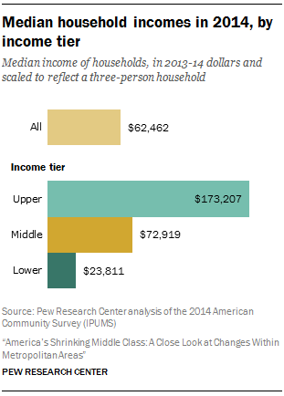
In 2014, the median income of U.S. households overall was $62,462, with half of households living on more than that amount and half living on less. Middle-class households, defined in this report as having incomes ranging from two-thirds to double the national median, had a median income of $72,919. Upper-income households were much better off, grossing $173,207 at the median. The median lower-income household earned only $23,811. 24

But the financial status of households ranged widely across metropolitan areas in 2014. Households in Midland, TX, with a median income of $90,743 in 2014, were the leaders among the 229 metropolitan areas examined. That was more than two times the median income of $39,752 for households in McAllen-Edinburg-Mission, TX, the lowest among the areas analyzed. 25

As shown in the accompanying map, metropolitan areas with relatively low median incomes—less than $60,000 in 2014—tend to be in the southern half of the U.S. Miami-Fort Lauderdale-West Palm Beach, Tampa-St. Petersburg-Clearwater and Orlando-Kissimmee-Sanford, three of Florida’s largest metropolitan areas, are in this group. So are Los Angeles-Long Beach-Anaheim and Riverside-San Bernardino-Ontario, both in California, and Las Vegas-Henderson-Paradise in Nevada. Overall, median household income was less than $60,000 in 88 of 229 metropolitan areas.

At the higher end of the income spectrum are 39 metropolitan areas in which the median household income was greater than $70,000 in 2014. The areas in this group are situated on both coasts, such as Boston-Cambridge-Newton, MA-NH, to the east and Seattle-Tacoma-Bellevue, WA, to the west, and in points in between, such as Denver-Aurora-Lakewood, CO; St. Louis, MO-IL; and Kansas City, MO-KS. In almost half the metropolitan areas—102 of 229—the median household income fell between $60,000 and $70,000 in 2014. The New York-Newark-Jersey City, NY-NJ-PA, area and several other large metropolitan areas are in this group, such as Chicago-Naperville-Elgin, IL-WI-IN; Dallas-Fort Worth-Arlington, TX; Atlanta-Sandy Springs-Roswell, GA; and Detroit-Warren-Dearborn, MI.26

Household incomes in many metropolitan areas in the southern part of the U.S. were less than the national median in 2014
U.S. metropolitan areas with the 10 highest and 10 lowest household incomes in 2014

With one exception, the 10 metropolitan areas with the highest median incomes in 2014 are also the areas that have the largest shares of upper-income residents in the country. Among the areas on both lists are Midland, TX, and Barnstable Town, MA. The exception is Minneapolis-St. Paul-Bloomington, MN-WI, where the median household income was $78,676 in 2014. The share of adults in the upper-income tier in the Minneapolis area was 25%, putting it in the top 15 on that score.

Similarly, the 10 metropolitan areas with the lowest median incomes in 2014 are virtually the same as the areas with the largest lower-income tiers (in share) in the country. The one exception is El Centro, CA, with a median household income of $42,969 in 2014. The share of adults in the lower-income tier in the El Centro area was 42%, the 11th highest in 2014.

Incomes of middle-class households in U.S. metropolitan areas

Middle-class households, by definition, earned from $41,641 to $124,924 in all U.S. metropolitan areas in 2014. Within this range, there still was a notable variation in the median income of middle-class households across areas. That is because households in an area may cluster near the top or the bottom end of the middle-income range, or be more evenly spread. The size of the middle class in an area, as measured by the share of adults who are middle income, bore no relationship to the median income of the middle class.

Middle-class households fared the best in Racine, WI, with a median annual income of $81,283 in 2014. That was 26% greater than the median income of middle-class households in Hanford-Corcoran, CA, which stood at $64,549, the lowest in the country. But in the majority of metropolitan areas examined—138 of 229—the median middle-class income fell within the range of $70,000 to $75,000.

Of the 10 metropolitan areas with the highest incomes for middle-class households in 2014, one area—Lebanon, PA—also had one of the largest middle-class shares in the country (63% of adults). The middle-class share was closer to the national average in the other nine areas, ranging from 49% in the Hartford-West Hartford-East Hartford, CT, and Washington-Arlington-Alexandria, DC-VA-MD-WV, areas to 56% in Anchorage, AK, and Manchester-Nashua, NH. However, the share of the upper-income tiers was generally above average in this group of metropolitan areas.

U.S. metropolitan areas with the highest and lowest incomes for middle-class households in 2014

The group of 10 metropolitan areas with the lowest incomes for middle-class households in 2014 includes Sheboygan, WI, in which 63% of adults were middle class. Also on this list is El Centro, CA, with one of the smallest middle-class shares in the country, along with Yuma, AZ, and Lake Havasu City-Kingman, AZ, which had among the biggest lower-income tiers (in share) in the U.S. Generally speaking, the upper-income tiers in these 10 areas were smaller than average in 2014, and the lower-income tiers were larger than average.

Incomes of households in the lower-income tier

Lower-income households had incomes of less than $41,641 in 2014. Subject to that constraint, the median income of these households was highest in Burlington-South Burlington, VT, at $30,943. At the bottom, the median income of lower-income households was only $18,113 in State College, PA. In the majority of metropolitan areas—163 of 229—the median income in the lower-income tier was within $20,000 up to $25,000 in 2014.

Several metropolitan areas with relatively high incomes for the lower-income tier were above average on other indicators as well—they either had large shares of adults who were middle income or upper income in 2014. This list includes Sheboygan, Wausau and Eau Claire, all in Wisconsin, and East Stroudsburg, PA; Barnstable Town, MA; and Ogden-Clearfield, UT.

U.S. metropolitan areas with the highest and lowest incomes for households in the lower-income tier in 2014

At the other extreme, metropolitan areas in which lower-income households had among the lowest median incomes were also areas with relatively large shares of adults in the lower-income tier in 2014. In particular, at least 35% of adults were lower-income in Hanford-Corcoran, CA; Gainesville, FL; Las Cruces, NM; Morgantown, WV; State College, PA; and also in the following areas in Texas: Brownsville-Harlingen, Laredo and McAllen-Edinburg-Mission.

Incomes of households in the upper-income tier

The upper-income tier consists of households that reported an income of $124,925 or more in 2014. Among these households, the median income ranged from $149,644 in Decatur, AL, to $205,191 in Bridgeport-Stamford-Norwalk, CT. Bridgeport was the only metropolitan area in which median income exceeded $200,000. In most metropolitan areas—184 of 229—the median income of the upper-income tier in 2014 fell shy of $175,000.

Only three of the 10 metropolitan areas with the highest-earning upper-income households had relatively large shares of adults in the upper-income tier. These three areas are Bridgeport-Stamford-Norwalk, CT; San Jose-Sunnyvale-Santa Clara, CA; and San Francisco-Oakland-Hayward, CA. Three other areas—Monroe, LA; Santa Cruz-Watsonville, CA; and Santa Maria-Santa Barbara, CA—had sizable lower-income tiers with at least three-in-ten adults in that tier.

U.S. metropolitan areas with the highest and lowest incomes for households in the upper-income tier in 2014

Among the 10 metropolitan areas with the lowest incomes for upper-income households, several featured relatively large middle classes. In this group, there are six areas in which at least 55% of adults were middle income in 2014: Wausau, WI; Glens Falls, NY; Saginaw, MI; Eau Claire, WI; Dover, DE; and Decatur, AL. Only one area, Muncie, IN, had more than three-in-ten adults in the lower-income tier.

Median incomes and income inequality are related to shares of adults in lower-, middle- and upper-income tiers

The shares of adults who are in the lower-, middle- or upper-income tiers reflect two key facets of the income distribution in a metropolitan area—the overall median household income in the area and the degree of income inequality, that is, the gap in the earnings of households near the top of the income distribution and the earnings of those near the bottom.

The extent of income inequality is strongly related to the middle-class share in a metropolitan area. Middle-income adults are a larger share of the adult population in areas with less income inequality and a smaller share of the adult population in areas with more inequality.

The following scatter plot depicts the general relationship between the middle-class share and income inequality. In the scatter plot, inequality is measured by the ratio of the incomes of households near the top (80th percentile in the income distribution) and the incomes of households near the bottom (20th percentile), or the 80/20 ratio. 27 The inverse relationship between the middle-class share and income inequality is evident and strong.

For example, Wausau, Janesville-Beloit and Sheboygan, the three areas with the largest middle classes in the U.S., had among the lowest levels of income inequality in 2014 across the U.S. metropolitan areas studied. In these three localities, all in Wisconsin, households at the 80th percentile had incomes about three times as high as the incomes of households at the 20th percentile. Conversely, the middle-class shares were among the lowest in Auburn-Opelika, AL, and Monroe, LA, and in these two localities the 80/20 income ratio was nearly as high as six.

The middle-class share was greater in metropolitan areas with lesser income inequality in 2014

The relationship between income inequality and the middle-class share shows that one is a reflection of the other. 28 When incomes of households near the bottom of the distribution are closer to the incomes of households near the top, it means that relatively more households may be found sitting within a narrower band of income. In other words, it raises the likelihood that more households are situated within the $41,641-to-$124,924 income band that defines the middle class. Meanwhile, if the distance between the top and bottom reaches of the income distribution is stretched farther, households are spread thinner and fewer of them are likely to fall within the middle-income band.

However, the median income in an area is not related to the share of adults who are in the middle class. That is because as the median household income increases, the middle-class share may increase because households leave the lower-income tier and join the middle—or the middle-class share may decrease because households transition from the middle- to the upper-income tier. The middle-class share may even remain unchanged if the movements out of the lower-income tier and into the upper-income tier balance each other out.

In 2014, metropolitan areas with higher incomes had larger upper-income tiers and smaller lower-income tiers

But the median income in an area does show the expected relationship with the shares of adults in upper- and lower-income tiers. In communities with higher overall median incomes, relatively more households may be expected to earn more than the $124,924 threshold for entry into the upper-income tier. A greater share of households may also be expected to earn more than $41,641, the way out of the lower-income tier. For example, in Midland, TX, the metropolitan area with the largest upper-income tier (37% of adults), the median household income was 45% greater than the national median income. In comparison, in Laredo, TX, one of the areas with the smallest upper-income tier (9% of adults), the median household income was 35% less than the national median income in 2014.

The more general relationships between median incomes in metropolitan areas and the shares of adults in lower- and upper-income tiers are depicted in the accompanying scatter plots. The relationships are as expected, and they are strong: as median income increases across metropolitan areas, the share of adults who are upper income increases in tandem, and the share of adults who are lower income decreases in close fashion. 29

3. The middle class shrank and incomes fell in most metropolitan areas from 2000 to 2014

The economic status of a metropolitan area in 2014 does not necessarily signal the direction of its journey. Midland, TX, led the nation in the share of the population that was upper income in 2014 because it benefited from a boom in global oil prices. But the sharp decline in oil prices since 2014 may put the Midland economy to the test.

Meanwhile, McAllen-Edinburg-Mission, TX, an area with one of the largest lower-income tiers in 2014, is on an upswing. Thanks to economic diversification and rising trade with Mexico, the middle-class share in the McAllen area has grown in recent years. These developments could also nurture a brighter future for the McAllen economy.

This chapter discusses the changes in the economic statues of metropolitan areas from 2000 to 2014. It focuses on overall changes in the economic status of adults, that is, on whether they experienced more movement up the income ladder than down the ladder. The chapter also shows how household incomes changed in metropolitan areas from 1999 to 2014. 30 Some of the evidence is presented in tables and maps in Appendix B, and additional data are available online.

The decline nationally in the share of adults who are middle class proved to be a pervasive local phenomenon in the period from 2000 to 2014. Among the 229 metropolitan areas examined, the share of adults living in middle-income households decreased in 203 areas. As the middle-class share declined, the share in the lower-income tier rose in 160 areas and the share in the upper-income tier increased in 172 areas. These trends were not mutually exclusive—the shares of adults in the lower- and upper-income tiers both increased in 108 metropolitan areas.

The hollowing in the middle of the income distribution has been accompanied by widespread erosion in the incomes of households from 1999 to 2014. Underscoring the lingering effects of the Great Recession of 2007-09, the median income of middle-income households fell in 222 of 229 metropolitan areas. The median income also fell in 221 areas for lower-income households and in 215 areas for upper-income households. All three tiers experienced a simultaneous loss in median income in 202 areas.

Metropolitan areas were about as likely to experience a gain in economic status as a loss

The economic status of a metropolitan area may be said to improve if more adults in the area experience a movement up the income ladder than down the ladder. A movement up the ladder could mean either a progression from the lower-income tier to the middle or from the middle-income tier to the upper-income tier. A movement down the ladder refers to either a decrease in the share of adults in the upper-income tier or an increase in the share in the lower-income tier.

In the U.S. overall, the share of adults in the middle class fell from 55% in 2000 to 51% in 2014. This decline in the middle was accompanied by dispersal in two directions. First, the share of adults in the upper-income tier increased from 17% to 20%, a change of 2 percentage points. 31 Second, the share of adults in the lower-income tier rose from 28% to 29%, an increase of 1 percentage point. The difference between these opposing movements—1 percentage point—is the net gain for American adults.

By this yardstick, U.S. metropolitan areas were roughly evenly divided between those that experienced an overall gain in economic status from 2000 to 2014 (the winners) and those that experienced an overall loss in economic status (the losers). In particular, across the 229 metropolitan areas analyzed, 119 were winners, with adults more likely to climb than to descend the income ladder, and 110 were losers. 32

The modest gain in economic status nationally—a net gain of 1 percentage point—concealed big differences in outcomes across metropolitan areas from 2000 to 2014. The biggest winners were Odessa and Midland, two energy-rich areas in Texas that each experienced a net gain of 26 percentage points. At the opposite end of the spectrum were Goldsboro, NC, and Springfield, OH, tied with a net loss of 16 percentage points in economic status. 33

There is no unifying thread that binds the biggest winners among the metropolitan areas. In Louisiana, for example, industries such as shipping and petrochemicals play large roles in New Orleans-Metairie and Baton Rouge, but information technology is more significant to the Lafayette economy. Meanwhile, Amarillo, TX, is principally a meat packing economy, while Barnstable Town, MA, is a tourist destination.

The economic status of adults improved in about half of U.S. metropolitan areas from 2000 to 2014

Overall, 43 metropolitan areas registered a net gain of at least 5 percentage points in the economic status of their adult populations. These areas are concentrated to the northeast and the Gulf Coast (see the accompanying map). The most prominent urban centers in this group are Washington-Arlington-Alexandria, DC-VA-MD-WV (net gain of 6 percentage points), and Boston-Cambridge-Newton, MA-NH (net gain of 7 percentage points).

The metropolitan areas that were among the biggest winners from 2000 to 2014 did not necessarily have relatively large upper-income tiers in 2014 as a result. For example, McAllen-Edinburg-Mission, TX, is one of the big winners, with a net gain of 8 percentage points. This is mainly because the share of adults who are lower-income in the McAllen area fell from 53% in 2000 to 46% in 2014. This led to an increase in the middle-class share from 39% to 45% and an increase in the upper-income share from 8% to 9%. But while the McAllen area retained one of the largest lower-income tiers in the country in 2014 and a smaller-than-average middle-class share, its economy appears to have improved significantly in recent years.

The second tier of winners—those with a net gain of up to 5 percentage points from 2000 to 2014—encompasses 76 metropolitan areas. These areas are generally dispersed across the country, although they appear more sparsely in the Rust Belt and in states due south. The two largest metropolitan areas in the country—New York-Newark-Jersey City, NY-NJ-PA, and Los Angeles-Long Beach-Anaheim, CA—are in this group.

The economies in the 10 metropolitan areas with the greatest losses in income status from 2000 to 2014 shared a greater-than-average reliance on manufacturing. Many of these areas are in the Rust Belt, including Springfield, OH, which, along with Goldsboro, NC, experienced the greatest loss in the country with a decrease of 16 percentage points.. The share of adults in the lower-income tier rose from 21% in 2000 to 32% in 2014 in Springfield, and the share in the upper-income tier fell from 18% to 13%.

The 10 areas that slipped the most in economic status are also generally struggling to recover jobs that were lost with the recessions this century. From 2000 to 2014, job losses in manufacturing in these areas ranged from 23% in Fort Wayne, IN, to 51% in Hickory-Lenoir-Morganton, NC, compared with 29% nationally. Other sectors did not entirely pick up the slack as overall private sector employment also fell, ranging from 3% in Goldsboro, NC, to 25% in Hickory-Lenoir-Morganton, NC. By comparison, private sector employment in the U.S. overall increased 5% from 2000 to 2014.

Atlanta-Sandy Springs-Roswell, GA, and Detroit-Warren-Dearborn, MI, are the largest of the metropolitan areas to experience a loss of at least 5 percentage points from 2000 to 2014. The loss was 8 percentage points in the Atlanta area and 10 percentage points in the Detroit area. Both areas experienced sizable increases in the shares of adults in the lower-income tier, from 20% to 27% in the Atlanta area and from 21% to 28% in the Detroit area. Other large metropolitan areas to experience losses include Chicago-Naperville-Elgin, IL-IN-WI; Dallas-Fort Worth-Arlington, TX; and Miami-Fort Lauderdale-West Palm Beach, FL, although the loss in each was less than 5 percentage points.

While the economic trajectory pointed down in 110 metropolitan areas, these are not necessarily areas with large shares of adults in the lower rungs of the income distribution. The majority of adults in most of these areas were in the middle class in 2014, including in predominantly middle-class communities such as Wausau, WI; Janesville-Beloit, WI; and Elkhart-Goshen, IN. Some other areas, such as Minneapolis-St. Paul-Bloomington, MN-WI, and Raleigh, NC, had larger-than-average upper-income tiers in 2014.

Changes in the shares of adults in lower-, middle- and upper-income tiers from 2000 to 2014

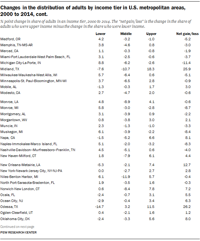
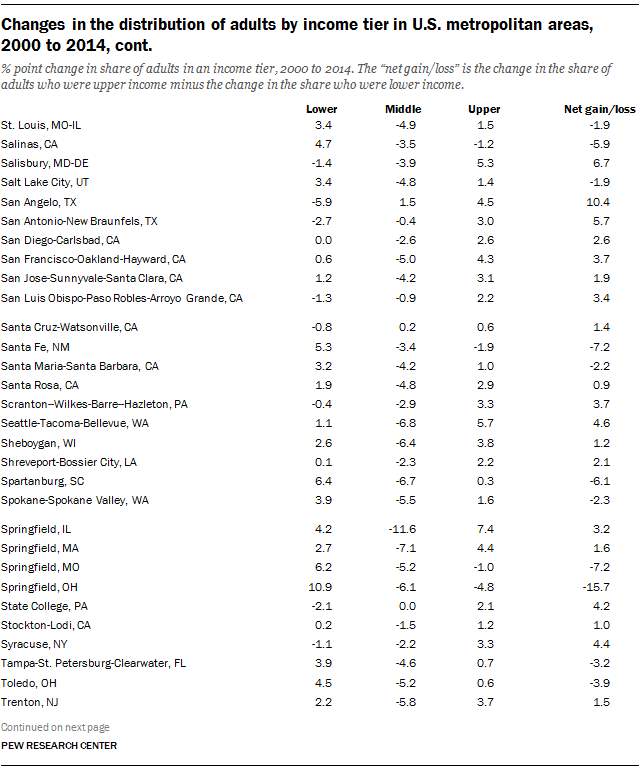
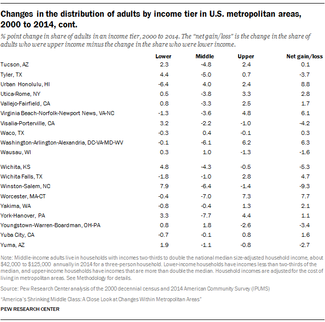
As discussed, the net economic gain or loss in a metropolitan area is the combination of changes in the shares of adults in the upper- and lower-income tiers. In turn, a change in the relative size of either tier is often accompanied by a change in the middle-class share. A table and a set of maps in Appendix B show the change in the share of adults in each income tier in the 229 metropolitan areas covered in this report.

The share of adults in the middle-income tier fell in 203 metropolitan areas. One of the greatest decreases was in Goldsboro, NC, where the middle-class share dropped by 12 percentage points, from 60% in 2000 to 48% in 2014. The greatest increase was in McAllen-Edinburg-Mission, TX, where the share rose by 6 percentage points, from 39% to 45%. In some 127 metropolitan areas, the middle-class share decreased by more than the nationwide drop of 3.6 percentage points.

The share of adults in the upper-income tier increased in 172 metropolitan areas. The leader was Midland, TX, where the share of the upper-income tier about doubled, from 18% in 2000 to 37% in 2014. At the other end of the spectrum was Springfield, OH, where the upper-income share fell from 18% to 13%, a loss of 5 percentage points. Some 101 areas exceeded the nationwide increase of 2.2 percentage points in the share of the upper-income tier.

The share of adults in the lower-income tier rose in 160 metropolitan areas. The biggest increase was 14 percentage points in Goldsboro, NC, where the lower-income share jumped from 27% in 2000 to 41% in 2014. Odessa, TX, experienced the largest decrease in the lower-income share, cutting it by 15 percentage points, from 39% to 24%. Some 122 metropolitan areas shared the unfortunate distinction of exceeding the 1.4 percentage point increase in the lower-income share nationally.

Incomes of households in all income tiers decreased around the country

Median incomes of households in all income tiers fell from 1999 to 2014

The redistribution of adults across the three economic tiers is one way to look at the change in the economic status of a metropolitan area from 2000 to 2014. But what about the fortunes of middle-class households, or the finances of households in the lower- and upper-income tiers in an area? Did they improve or worsen in the recent past? As it turns out, households in all income tiers were financially worse off in 2014 than in 1999 in the vast majority of metropolitan areas.

The median income of households in all three economic tiers—lower, middle and upper—decreased substantially from 1999 to 2014. Nationally, the median income of all households combined fell from $67,673 in 1999 to $62,462 in 2014, or by 8%. Among middle-class households, the median income shrank from $77,898 in 1999 to $72,919 in 2014, a reduction of 6%. The median incomes of lower-income and upper-income households fell by 10% and 7%, respectively. 34

The financial setback for households was a shared experience across virtually all metropolitan areas. The overall median income fell in 190 of 229 areas from 1999 to 2014. The greatest loss was in Springfield, OH, where the median household income plunged 27%, from $73,895 in 1999 to $53,957 in 2014. (Data on median incomes in all 229 areas, by income tier, are available online in a set of supplementary tables.)

What transpired in Springfield was not an isolated development. Seven other communities sustained losses of at least 20%. Four of these areas were in North Carolina: Goldsboro, Rocky Mount, Burlington and Hickory-Lenoir-Morganton. 35

More generally, double-digit losses in median incomes (10% or more from 1999 to 2014) prevailed in 95 metropolitan areas. As seen in the following map, these metropolitan areas are to be found around the country, with the exception of the northeastern coast. The most populated metropolitan areas in this group are Chicago-Naperville-Elgin, IL-IN-WI; Miami-Fort Lauderdale-West Palm Beach, FL; and Atlanta-Sandy Springs-Roswell, GA.

Additionally, median incomes fell by up to 10% in 95 other metropolitan areas. The New York and Los Angeles areas belong to this group of metropolitan areas. Many of the country’s largest metropolitan areas fall into this category too, including Dallas-Fort Worth-Arlington, TX; Houston-The Woodlands-Sugar Land, TX; Philadelphia-Camden-Wilmington, PA-NJ-DE-MD; San Francisco-Oakland-Hayward, CA; Phoenix-Mesa-Scottsdale, AZ; and Riverside-San Bernardino-Ontario, CA.

A small group of metropolitan areas, 39 in all, experienced an increase in median household income from 1999 to 2014. Midland, TX, in which the median income increased by 37%, stands out in this select group of localities. Household incomes rose by more than 20% in only one other area—Odessa, TX. There are only 10 areas in which the median household income increased by more than 5% from 1999 to 2014. The two largest metropolitan areas to experience rising incomes in this period are Washington-Arlington-Alexandria, DC-VA-MD-WV, and Boston-Cambridge-Newton, MA-NH.

The median income of households fell in the vast majority of the U.S. metropolitan areas from 1999 to 2014

Changes in the incomes of middle-class households

Middle-class households across the country experienced a financial shock from 1999 to 2014 as their median income decreased in 222 of the 229 metropolitan areas examined.

Metropolitan areas with relatively large shares of adults in the middle class were not immune to the squeeze on their finances. In fact, among the middle class, the largest decrease in median income was felt by households in Sheboygan, WI. In Sheboygan, where 63% of adults are middle class, the median income of middle-class households fell by 17%, from $80,281 in 1999 to $66,719 in 2014. As a result, compared with its peers, the middle class in Sheboygan ranked among the bottom 10 in earnings in 2014.

Other largely middle-class localities that experienced significant losses in income include Janesville-Beloit and Eau Claire in Wisconsin and Elkhart-Goshen in Indiana. The middle class in these areas experienced at least a 10% decrease in median income from 1999 to 2014. Thus, while these communities retained their middle-class character in 2014, the financial security of middle-class households in them has deteriorated relatively sharply since 1999.

Overall, the median income of middle-class households fell by at least 10% from 1999 to 2014 in 30 metropolitan areas. More commonly, middle-class incomes decreased from 5% up to 10% in 127 metropolitan areas and by up to 5% in 65 other areas.

The middle class gained financially in only seven metropolitan areas. Midland, TX, was one of the areas in this spare group, but only because the median middle-class households there continued to earn about $77,000 in 2014, just as it did in 1999. The largest gain in income for the middle class was in Grand Junction, CO, where the median increased from $72,152 in 1999 to $75,949, or by 5%.

Changes in the incomes of households in the upper-income tier

Households in the upper-income tier were not immune to harder times financially. From 1999 to 2014, the median income of the upper-income tier fell in 215 of the 229 metropolitan areas examined.

Among upper-income households, the greatest decrease in income transpired in Naples-Immokalee-Marco Island, FL, where the median fell from $253,117 in 1999 to $197,739 in 2014, a loss of 22%. In about a quarter of metropolitan areas—54 of 229—the median income of upper-income households in 2014 was at least 10% lower than in 1999. Perhaps ironically, this group included Midland, TX, the area that registered the greatest increase in the share of adults in the upper-income tier. The median income of the upper-income tier in Midland dropped from $202,270 in 1999 to $181,282 in 2014. 36

For the upper-income tier, losses in the order of 5% to 10% were most common, prevailing in 114 metropolitan areas. Several areas with relatively large upper-income tiers in 2014 belong to this group, including Barnstable Town, MA; Boston-Cambridge-Newton, MA-NH; Bridgeport-Stamford-Norwalk, CT; Norwich-New London, CT; and San Francisco-Oakland-Hayward, CA. In addition, the incomes of upper-income households fell by up to 5% in 47 areas.

The 14 metropolitan areas in which the upper-income tier improved financially from 1999 to 2014 were led by Muskegon, MI. In Muskegon, the median income of the upper-income tier increased by 7%, from $165,709 in 1999 to $177,981 in 2014. The upper-income tier in State College, PA, also did better over time as its median income inched up 1%. Combined with the sharp decrease in the income of the lower-income tier (see next section), income inequality rose sharply in State College. 37

Changes in the incomes of households in the lower-income tier

Akin to the experience of the middle class, the median income of households in the lower-income tier decreased in 221 of the 229 metropolitan areas examined. But lower-income households took more of a financial blow from 1999 to 2014.

Within the lower-income tier, the greatest loss was felt by households in State College, PA. The median income of lower-income households there decreased from $26,190 in 1999 to $18,113 in 2014, or by 31%. Overall, losses of at least 10% were experienced by lower-income households in 134 metropolitan areas, including 35 areas in which their median income fell by at least 15%. The latter group of 35 included Laredo, TX; Yuma, AZ; and Las Cruces, NM—three areas with among the 10 highest shares of adults in the lower-income tier in 2014.

The small group of metropolitan areas in which lower-income households experienced gains in income is led by Burlington-South Burlington, VT. In that area, the median income of the lower-income tier rose from $27,674 in 1999 to $30,943 in 2014, an increase of 12%. The lower-income tiers in Odessa, TX, and Midland, TX, also experienced modest gains in income, by 2% and 1%, respectively.

Changes in income and income inequality are related to changes in the shares of adults in lower-, middle- and upper-income tiers

From 2000 to 2014, upper-income tiers grew in areas where incomes rose, or fell by less; lower-income tiers grew more in areas with more of a decrease in income

The shares of adults in lower-income households increased in most U.S. metropolitan areas from 2000 to 2014. How much this share increased is related to how much the median income in an area decreased—the more steeply incomes fell, the more the lower-income share increased. Similarly, areas with higher growth in median incomes, or less of a decrease, were more likely to experience an increase in the share of adults in the upper-income tier.

Changes in the share of adults in the middle class are not related to changes in median income, but they are related to changes in the degree of income inequality. Across metropolitan areas, greater increases in income inequality are associated with greater decreases in the middle-class share.

The general relationships between the change in median incomes in metropolitan areas and the change in the shares of adults in lower- and upper-income tiers are depicted in the accompanying scatter plots. The relationships are evidently strong and as described. 38

Toward one end is an area such as Odessa, TX, where the overall median income increased by 22% from 1999 to 2014. In Odessa, the lower-income share decreased by nearly 15 percentage points from 2000 to 2014 and the upper-income share increased by about 12 percentage points. Toward the other end is an area such as Springfield, OH, where the overall median income plunged 27%. Related to this drop in income, the lower-income share in Springfield increased 11 percentage points from 2000 to 2014 and the upper-income share decreased 5 percentage points.

The middle-class share fell more in metropolitan areas with more of an increase in income inequality from 2000 to 2014

Increases in income inequality were the norm in U.S. metropolitan areas this century. From 1999 to 2014, the ratio of the incomes of households at the 80th percentile in the income distribution and the incomes of households at the 20th percentile, the 80/20 ratio, increased in 211 of the 229 areas.

Bigger increases in inequality are associated with larger decreases in the middle-class share. 39 In Springfield, IL, for example, the 80/20 ratio increased 46%, from 3.2 in 1999 to 4.7 in 2014. Meanwhile, the middle-class share in Springfield fell by 12 percentage points.

Twelve of the 18 metropolitan areas in which inequality decreased from 1999 to 2014 experienced an increase in the middle-class share. This group included Hilton Head Island-Bluffton-Beaufort, SC, where the middle-class share increased 5 percentage points; Madera, CA (4 points); Urban Honolulu, HI (4 points); Odessa, TX (3 points); and Kankakee, IL (2 points). These changes in the middle-class share ranked among the 10 largest increases in the U.S. from 2000 to 2014.

Acknowledgments

This report is a collaborative effort based on the input and analysis of the following individuals:

Rakesh Kochhar, Associate Director, Research Richard Fry, Senior ResearcherKim Parker, Director of Social Trends Research Claudia Deane, Vice President, Research Anna Brown, Research Assistant Michael Keegan, Information Graphics Designer Renee Stepler, Research Assistant Gustavo López, Research Assistant Danielle Alberti, Web Developer Yolanda Martinez, Digital Producer Kelly Browning, User Experience Designer Marcia Kramer, Kramer Editing Services

Methodology

Data Sources

The data in the report are derived from the public-use versions of the 2000 decennial census and the 2014 American Community Survey (ACS). The 2000 decennial census public-use file is a 5% sample of the U.S. population. The ACS contains more than 3 million records, or about 1% of the U.S. population. It is designed to collect the detailed information previously collected in the long form of the decennial census.

The ACS is conducted in every month of the year, with data collected from about one-twelfth of the total sample in each month. The monthly responses are combined to form an annual portrait of the nation and of smaller geographic units. Because of its large sample size, the ACS is one of the Census Bureau’s recommended sources for subnational income data.

The specific ACS and decennial census microdata used in this report are the Integrated Public Use Microdata Series (IPUMS) versions provided by the University of Minnesota. The IPUMS assigns uniform codes, to the extent possible, to data collected in the ACS and censuses over the years. More information about the IPUMS, including variable definition and sampling error, is available at https://usa.ipums.org/usa/.

Income

The 2000 census was conducted in April of that year and collected data on income received by a household during calendar year 1999. The ACS is a rolling monthly survey, and the household income data refer to income received during the 12 months preceding the survey month. In other words, a household surveyed in January 2014 is expected to report income received from January 2013 to December 2013, a household surveyed in February 2014 is expected to report income received from February 2013 to January 2014, and so on. Households surveyed in December 2014 report income received from December 2013 to November 2014. Thus, in the 2014 ACS, the income data refer to the period from January 2013 to November 2014, a total time span of 23 months.

Household income is the sum of incomes received by all members of the household ages 15 and older. Income is defined as money income received (exclusive of certain money receipts, such as capital gains) before payments for such things as personal income taxes, Social Security, union dues and Medicare deductions. Non-cash transfers, such as food stamps, health benefits, subsidized housing and energy assistance, are not included. More detail on the measurement and collection of income in the ACS is available in periodic Census Bureau reports.

In this report, incomes are adjusted for inflation with the Consumer Price Index for All Urban Consumers (CPI-U) published by the U.S. Bureau of Labor Statistics (BLS). Because the 2000 decennial census gathered data on incomes for 1999 and the 2014 ACS gathered data on incomes spanning the 2013-14 calendar years, the inflation adjustment in this report is based on the CPI-U for 1999 and the average of the price indexes from 2013 and 2014. Thus, all income data in the report are expressed in 2013-14 prices.

The choice of a price index has no bearing on the allocation of households into lower-, middle- or upper-income categories at a point in time. That is because the same price index applies to the incomes of all households and does not affect their income-based rank.

The choice of time periods

When examining trends in economic indicators over time, it is generally desirable to avoid comparisons across different points of the business cycle. The income comparisons in this study are based on data pertaining to 1999 and 2013-14. The starting point, 1999, was near the peak of a business cycle, whereas 2013-14 period is in the midst of an economic expansion. 40 Thus, the income comparisons may not involve exactly comparable points in the business cycle.

Households in census data

The Census Bureau defines a household as the entire group of persons who live in a single dwelling unit. A household may consist of several persons living together or one person living alone. It includes the household head and all of his or her relatives living in the dwelling unit and also any lodgers, live-in housekeepers, nannies and other residents not related to the head of the household.

Adjusting income for household size

Household income data reported in this study are adjusted for the number of people in a household. That is done because a four-person household with an income of, say, $50,000 faces a tighter budget constraint than a two-person household with the same income. In addition to comparisons across households at a given point in time, this adjustment is useful for measuring changes in the income of households over time. That is because average household size in the United States decreased from 3.1 persons in 1970 to 2.5 persons in 2015, a drop of 19%. Ignoring this demographic change would mean ignoring a commensurate loosening of the household budget constraint.

At its simplest, adjusting for household size could mean converting household income into per capita income. Thus, a two-person household with an income of $50,000 would have a per capita income of $25,000, double the per capita income of a four-person household with the same total income.

A more sophisticated framework for household size adjustment recognizes that there are economies of scale in consumer expenditures. For example, a two-bedroom apartment may not cost twice as much to rent as a one-bedroom apartment. Two household members could carpool to work for the same cost as a single household member, and so on. For that reason, most researchers make adjustments for household size using the method of “equivalence scales.” 41

A common equivalence-scale adjustment is defined as follows:

Adjusted household income = Household income / (Household size)N

By this method, household income is divided by household size exponentiated by “N,” where N is a number between 0 and 1.

Note that if N = 0, the denominator equals 1. In that case, no adjustment is made for household size. If N = 1, the denominator equals household size, and that is the same as converting household income into per capita income. The usual approach is to let N be some number between 0 and 1. Following other researchers, this study uses N = 0.5. 42 In practical terms, this means that household income is divided by the square root of household size – 1.41 for a two-person household, 1.73 for a three-person household, 2.00 for a four-person household and so on. 43

Once household incomes have been converted to a “uniform” household size, they can be scaled to reflect any household size. The income data reported in this study are computed for three-person households, the closest whole number to the average size of a U.S. household since 1970. That is done as follows:

[(3)0.5]

As discussed in the main body of the report, adjusting for household size has had an effect on trends in income since 1970. However, it is important to note that once the adjustment has been made, it is immaterial whether one scales incomes to one-, two-, three- or four-person households. Regardless of the choice of household size, the same results would emerge with respect to the trends in the well-being of lower-, middle- and upper-income groups.

Appendix A: References

Burkhauser, Richard V., Amy Crews Cutts, Mary C. Daly and Stephen P. Jenkins. 1999. “Testing the Significance of Income Distribution Changes Over the 1980s Business Cycle: A Cross-National Comparison.” Journal of Applied Econometrics, Vol. 14, No. 3.

Cingano, Federico. 2014. “Trends in Income Inequality and its Impact on Economic Growth.” Paris, France: Organization for Economic Cooperation and Development, December. http://www.oecd-ilibrary.org/social-issues-migration-health/trends-in-income-inequality-and-its-impact-on-economic-growth_5jxrjncwxv6j-en

Dabla-Norris, Era, Kalpana Kochhar, Nujin Suphaphiphat, Frantisek Ricka and Evridiki Tsounta. 2015. “Causes and Consequences of Income Inequality: A Global Perspective.” Washington, D.C.: International Monetary Fund, June. http://www.imf.org/external/pubs/ft/sdn/2015/sdn1513.pdf

Debels, Annelies and Leen Vandecasteele. 2008. “The Time Lag in Annual Household-Based Income Measures: Assessing and Correcting the Bias.” Review of Income and Wealth, Vol. 54, No. 1.

Garner, Thesia I., Javier Ruiz-Castillo and Mercedes Sastre. 2003. “ The Influence of Demographics and Household-Specific Price Indices on Consumption-Based Inequality and Welfare: A Comparison of Spain and the United States.” Southern Economic Journal, Vol. 70, No. 1.

Hout, Michael. 2007. “How Class Works in Popular Conception: Most Americans Identify With the Class Their Income, Occupation, and Education Implies for Them.” Berkeley, CA: Survey Research Center, February. http://ucdata.berkeley.edu/publication_record.php?recid=96

Johnson, David S., Timothy M. Smeeding and Barbara Boyle Torrey. 2005. “Economic Inequality Through the Prisms of Income and Consumption.” Monthly Labor Review, April. http://www.bls.gov/opub/mlr/2005/04/art2full.pdf

Krueger, Alan B. 2012. “The Rise and Consequences of Inequality in the United States.” Council of Economic Advisers. Speech given to Center for American Progress, Washington, D.C., January 12. http://www.whitehouse.gov/sites/default/files/krueger_cap_speech_final_remarks.pdf

Ostry, Jonathan D., Andrew Berg and Charalambos G. Tsangarides. 2014. “Redistribution, Inequality, and Growth.” Washington, D.C.: International Monetary Fund, February. http://www.imf.org/external/pubs/ft/sdn/2014/sdn1402.pdf

Pew Research Center. 2008. “Inside the Middle Class: Bad Times Hit the Good Life.” Washington, D.C.: April. https://alpha.pewresearch.org/pewresearch-org/social-trends/2008/04/09/inside-the-middle-class-bad-times-hit-the-good-life/

Pew Research Center. 2012. “The Lost Decade of the Middle Class.” Washington, D.C.: August. https://alpha.pewresearch.org/pewresearch-org/social-trends/2012/08/22/the-lost-decade-of-the-middle-class/

Pew Research Center. 2015. “The American Middle Class Is Losing Ground: No longer the majority and falling behind financially.” Washington, D.C.: December. https://alpha.pewresearch.org/pewresearch-org/social-trends/2015/12/09/the-american-middle-class-is-losing-ground

[Machine-readable database]

Savage, Mike, Fiona Devine, Niall Cunningham, Mark Taylor, Yaojun Li, Johs. Hjellbrekke, Brigitte Le Roux, Sam Friedman and Andrew Miles. 2013. “A New Model of Social Class: Findings From the BBC’s Great British Class Survey Experiment.” Sociology, April. http://soc.sagepub.com/content/early/2013/03/12/0038038513481128

Short, Kathleen, Thesia Garner, David Johnson and Patricia Doyle. 1999. “Experimental Poverty Measures, 1990 to 1997.” Washington, D.C.: U.S. Census Bureau, June. https://www.census.gov/prod/99pubs/p60-205.pdf

Summers, Lawrence H. and Ed Balls. 2015. “Report of the Commission on Inclusive Prosperity.” Washington, D.C.: Center for American Progress, January. https://www.americanprogress.org/issues/economy/report/2015/01/15/104266/report-of-the-commission-on-inclusive-prosperity

Appendix B: Detailed tables and maps

Distribution of adults by income tier in U.S. metropolitan areas, 2000 and 2014, cont.
Changes in the distribution of adults by income tier in U.S. metropolitan areas, 2000 to 2014
Changes in the distribution of adults by income tier in U.S. metropolitan areas, 2000 to 2014, cont.
The middle-class share fell in almost all U.S. metropolitan areas from 2000 to 2014
The share of adults in upper-income households increased in the vast majority of the U.S. metropolitan areas rom 2000 to 2014
The share of adults in lower-income households increased in most U.S. metropolitan areas from 2000 to 2014