
Pew Research Center

FOR RELEASE DECEMBER 9, 2015

The American Middle Class Is Losing Ground

No longer the majority and falling behind financially

FOR MEDIA OR OTHER INQUIRIES:

Communications Department
202.419.4372
www.pewresearch.org

RECOMMENDED CITATION

Pew Research Center, December 2015, "The American Middle Class Is Losing Ground"

About Pew Research Center

Pew Research Center is a nonpartisan, nonadvocacy fact tank that informs the public about the issues, attitudes and trends shaping the world. It does not take policy positions. The Center conducts public opinion polling, demographic research, computational social science research and other data-driven research. It studies politics and policy; news habits and media; the internet and technology; religion; race and ethnicity; international affairs; social, demographic and economic trends; science; research methodology and data science; and immigration and migration. Pew Research Center is a subsidiary of The Pew Charitable Trusts, its primary funder.

© Pew Research Center 2026

Table of contents

  • About Pew Research Center
  • The American Middle Class Is Losing Ground
  • 1. The hollowing of the American middle class
  • 2. Changes in income status vary across demographic groups
  • 3. Middle-income adults largely reflect the nation’s demographics
  • 4. Middle class incomes fall further behind upper-tier incomes
  • 5. Wealth gap between middle-income and upper-income families reaches record high
  • Acknowledgments
  • Methodology
  • Appendix A: References

The American Middle Class Is Losing Ground

No longer the majority and falling behind financially

After more than four decades of serving as the nation’s economic majority, the American middle class is now matched in number by those in the economic tiers above and below it. In early 2015, 120.8 million adults were in middle-income households, compared with 121.3 million in lower- and upper-income households combined, a demographic shift that could signal a tipping point, according to a new Pew Research Center analysis of government data.1

In at least one sense, the shift represents economic progress: While the share of U.S. adults living in both upper- and lower-income households rose alongside the declining share in the middle from 1971 to 2015, the share in the upper-income tier grew more.

And middle-income Americans have fallen further behind financially in the new century. In 2014, the median income of these households was 4% less than in 2000. Moreover, because of the housing market crisis and the Great Recession of 2007-09, their median wealth (assets minus debts) fell by 28% from 2001 to 2013.

Meanwhile, the far edges of the income spectrum have shown the most growth. In 2015, 20% of American adults were in the lowest-income tier, up from 16% in 1971. On the opposite side, 9% are in the highest-income tier, more than double the 4% share in 1971. At the same time, the shares of adults in the lower-middle or upper-middle income tiers were nearly unchanged.

ST_15.11.20_Middle-Income-Calc_Promo_140x140

Are you in the American middle class?

Find out with our income calculator.

Our new calculator allows you to see which group you fit in, first compared with all American adults, and then compared with other adults similar to you in education, age, race or ethnicity, and marital status.

The state of the American middle class is at the heart of the economic platforms of many presidential candidates ahead of the 2016 election. Policymakers are engaged in debates about the need to raise the floor on wages and on how best to curb rising income inequality. Meanwhile, President Barack Obama uses the term “middle-class economics” to describe his economic agenda.2 And a flurry of new research points to the potential of a larger middle class to provide the economic boost sought by many advanced economies.3

The news regarding the American middle class is not all bad. Although the middle class has not kept pace with upper-income households, its median income, adjusted for household size, has risen over the long haul, increasing 34% since 1970. That is not as strong as the 47% increase in income for upper-income households, though it is greater than the 28% increase among lower-income households.4

Moreover, some demographic groups have fared better than others in moving up the income tiers, while some groups have slipped down the ladder. The groups making notable progress include older Americans, married couples and blacks. Despite this progress, older Americans and blacks remain more likely to be lower income and less likely to be upper income than adults overall. Those Americans without a college degree stand out as experiencing a substantial loss in economic status.

In addition to changes in the size and economic standing of the American middle class, its demographic profile has changed significantly in recent decades. Some of the changes reflect long-term demographic trends in the U.S., as the middle class is in many ways a mirror of the broader population. For example, the aging of the country, the growing racial and ethnic diversity, the decline in marriage rates and the overall rise in educational attainment are all reflected in the changing composition of the middle class.

Who is middle income?
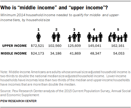
Who is “middle income” and “upper income”?

In this report, “middle-income” households are defined as those with an income that is 67% to 200% (two-thirds to double) of the overall median household income, after incomes have been adjusted for household size.5 Lower-income households have incomes less than 67% of the median, and upper-income households have incomes that are more than double the median.

The income it takes to be middle income varies by household size, with smaller households requiring less to support the same lifestyle as larger households. For a three-person household, the middle-income range was about $42,000 to $126,000 annually in 2014. However, a one-person household needed only about $24,000 to $73,000 to be middle income. For a five-person household to be considered middle income, its 2014 income had to range from $54,000 to $162,000.6

In addition, the lower-income group is divided into lowest-income households (with income less than half of the overall median) and lower-middle income households (with incomes from half to less than two-thirds of the overall median). In 2014, a lowest-income household with three people lived on about $31,000 or less, and a lower-middle income household lived on about $31,000 to $42,000.7

Likewise, upper-income households are divided into upper-middle income households (with more than twice the overall median income and up to three times the median) and highest-income households (with more than three times the overall median income). In 2014, an upper-middle income household with three people lived on about $126,000 to $188,000, and a highest-income household lived on more than $188,000.

Middle income or middle class?

The terms “middle income” and “middle class” are often used interchangeably. This is especially true among economists who typically define the middle class in terms of income or consumption. But being middle class can connote more than income, be it a college education, white-collar work, economic security, owning a home, or having certain social and political values. Class could also be a state of mind, that is, it could be a matter of self-identification (Pew Research Center, 2008, 2012). The interplay among these many factors is examined in studies by Hout (2007) and Savage et al. (2013), among others.

This report uses household income to group people. For that reason, the term “middle income” is used more often than not. However, “middle class” is also used at times for the sake of exposition.

The middle class shrinks
Share of adults living in middle-income households is falling

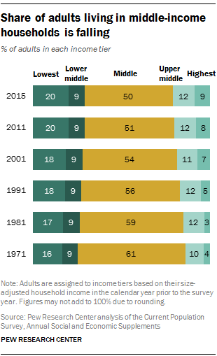
The hollowing of the American middle class has proceeded steadily for more than four decades. Since 1971, each decade has ended with a smaller share of adults living in middle-income households than at the beginning of the decade, and no single decade stands out as having triggered or hastened the decline in the middle.

Based on the definition used in this report, the share of American adults living in middle-income households has fallen from 61% in 1971 to 50% in 2015. The share living in the upper-income tier rose from 14% to 21% over the same period. Meanwhile, the share in the lower-income tier increased from 25% to 29%. Notably, the 7 percentage point increase in the share at the top is nearly double the 4 percentage point increase at the bottom.

The rising share of adults in the lower- and upper-income tiers is at the farthest points of the income distribution, distant from the vicinity of the middle. The share of American adults in the lowest-income tier rose from 16% in 1971 to 20% in 2015. Over the same period, the share of American adults in lower-middle income households did not change, holding at 9%.

The growth at the top is similarly skewed. The share of adults in highest-income households more than doubled, from 4% in 1971 to 9% in 2015. But the increase in the share in upper-middle income households was modest, rising from 10% to 12%. Thus, the closer look at the shift out of the middle reveals that a deeper polarization is underway in the American economy.

The middle class falls further behind upper-income households financially
Growth in income for middle-income households is less than the growth for upper-income households since 1970

The gaps in income and wealth between middle- and upper-income households widened substantially in the past three to four decades. As noted, one result is that the share of U.S. aggregate household income held by upper-income households climbed sharply, from 29% in 1970 to 49% in 2014.8 More recently, upper-income families, which had three times as much wealth as middle-income families in 1983, more than doubled the wealth gap; by 2013, they had seven times as much wealth as middle-income families.

Trends in income

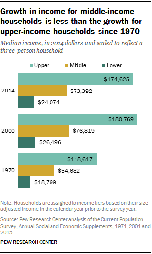
Households in all income tiers experienced gains in income from 1970 to 2014. But the gains for middle- and lower-income households lagged behind the gains for upper-income households.

The median income of upper-income households increased from $118,617 in 1970 to $174,625 in 2014, or by 47%. That was significantly greater than the 34% gain for middle-income households, whose median income rose from $54,682 to $73,392. Lower-income households fell behind even more as their median income increased by only 28% over this period.

Although 2014 incomes are generally higher than in 1970, all households experienced a lengthy period of decline in the 21st century thanks to the 2001 recession and the Great Recession of 2007-09. The greatest loss was felt by lower-income households, whose median income fell 9% from 2000 to 2014, followed by a 4% loss for middle-income households and a 3% loss for upper-income households.

Trends in wealth
The wealth gap between upper- and middle-income families is growing

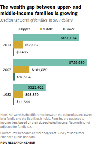
The Great Recession of 2007-09, which caused the latest downturn in incomes, had an even greater impact on the wealth (assets minus debts) of families. The losses were so large that only upper-income families realized notable gains in wealth over the span of 30 years from 1983 to 2013 (the period for which data on wealth are available).9

Before the onset of the Great Recession, the median wealth of middle-income families increased from $95,879 in 1983 to $161,050 in 2007, a gain of 68%. But the economic downturn eliminated that gain almost entirely. By 2010, the median wealth of middle-income families had fallen to about $98,000, where it still stood in 2013.

Upper-income families more than doubled their wealth from 1983 to 2007 as it climbed from $323,402 to $729,980. Despite losses during the recession, these families recovered somewhat since 2010 and had a median wealth of $650,074 in 2013, about double their wealth in 1983.

The disparate trends in the wealth of middle-income and upper-income families are due to the fact that housing assumes a greater role in the portfolios of middle-income families. The crash in the housing market that preceded the Great Recession was more severe and of longer duration than the turmoil in the stock market. Thus, the portfolios of upper-income families performed better than the portfolios of middle-income families from 2007 to 2013. When all is said and done, upper-income families, which had three times as much wealth as middle-income families in 1983, had seven times as much in 2013.

Demographic winners and losers
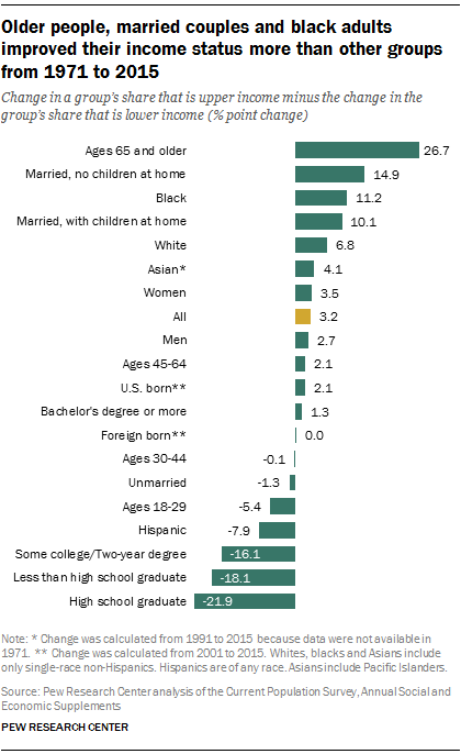
Older people, married couples and black adults improved their income status more than other groups from 1971 to 2015

As the middle has hollowed, some demographic groups have been more likely to advance up the income tiers (winners) while others were more likely to retreat down the economic ladder (losers).

Nationally, the share of adults in the upper-income tier increased from 14% in 1971 to 21% in 2015, a gain of 7 percentage points. Meanwhile, the share of adults in the lower-income tier also rose, from 25% to 29%, an increase of 4 percentage points. The difference – 3 percentage points – is the net gain for American adults. By the same measure, the net gain in economic status varied across demographic groups.10

The economic status of adults with a bachelor’s degree changed little from 1971 to 2015, meaning that similar shares of these adults were lower-, middle- or upper-income in those two years. Those without a bachelor’s degree tumbled down the income tiers, however. Among the various demographic groups examined, adults with no more than a high school diploma lost the most ground economically.

Winners also include married adults, especially couples where both work. On the flip side, being unmarried is associated with an economic loss. This coincides with a period in which marriage overall is on the decline but is increasingly linked to higher educational attainment.

Gains for women edged out gains for men, a reflection of their streaming into the labor force in greater numbers in the past four decades, their educational attainment rising faster than among men, and the narrowing of the gender wage gap.11

Among racial and ethnic groups, blacks and whites came out winners, but Hispanics slipped down the ladder. Although blacks advanced in income status, they are still more likely to be lower income and less likely to be upper income than whites or adults overall. For Hispanics, the overall loss in income status reflects the rising share of lower-earning immigrants in the adult population, from 29% in 1970 to 49% in 2015. Considered separately, both U.S.-born and foreign-born Hispanics edged up the economic tiers.

Road map to the report

This report divides households into three income tiers – lower income, middle income and upper income – depending on how their income compares with overall median household income. The analysis focuses on changes in the size and demographic composition of the three income tiers and on trends in their economic wellbeing. Unless otherwise noted, incomes are adjusted for household size and scaled to reflect a household size of three.

Households that are in the lower-, middle- or upper-income tier in one year are compared with households that are in one of those tiers in another year. The analysis does not follow the same households over time, and some households that were middle income in one year, say, may have moved to a different tier in a later year. The demographic composition of each income tier may also have changed from one year to the next.

The next section of the report describes the size of the U.S. adult population in each income tier and analyzes how it changed from 1971 to 2015. The lower- and upper-income tiers are also subdivided into two tiers each for a closer examination of the dispersion of the adult population: lowest income, lower-middle income, upper-middle income and highest income.

The report then turns to a demographic analysis of the three main income tiers. First, the report examines how changes in the size of lower-, middle- and upper-income tiers have played out differently across demographic groups. The key demographic breaks include age, marital status, gender, race and ethnicity, nativity, education, occupation and industry. Next, the report briefly examines the demographic composition of the middle-income population and how it compares with the population of adults overall and adults in lower- and upper-income tiers.

The final two sections of the report focus on the economic wellbeing of middle-income households, including how it has changed over time and how it compares with the wellbeing of lower- and upper-income households. The first of these two sections examines trends in household income and the second focuses on family wealth, assets and debts.

Terminology

“Middle-income” households are defined as those with an income that is two-thirds to double that of the U.S. median household income, after incomes have been adjusted for household size. For a three-person household, the middle-income range was about $42,000 to $126,000 annually in 2014 (in 2014 dollars). Lower-income households have incomes less than two-thirds of the median, and upper-income households have incomes that are more than double the median.

Unless otherwise noted, incomes are adjusted for household size and scaled to reflect a household size of three. Adults are placed into income tiers based on their household income in the calendar year previous to the survey year. Thus, the income data in the report refer to the 1970-2014 period, and the demographic data from the same survey refer to the 1971-2015 period.

Whites, blacks and Asians include only the single-race, non-Hispanic component of those groups. Hispanics are of any race. Asians include Pacific Islanders. Other racial/ethnic groups are included in all totals but are not shown separately.

Adults with a high school education are those who have obtained a high school diploma or its equivalent, such as a General Educational Development (GED) certificate. Adults with “some college” education comprise those completing associate degrees as well as those completing any college at all, including less than one year. Prior to 1990, adults “with at least a college degree” refer to those who completed at least four years of college.

“Unmarried” includes “married, spouse absent,” never married, divorced, separated and widowed. “Married” includes opposite-sex couples only, because trends are not available for same-sex couples. “With children at home” includes adults with at least one biological, adopted or step child of any age in the household.

“Foreign born” refers to people born outside of the United States, Puerto Rico or other U.S. territories to parents neither of whom was a U.S. citizen, regardless of legal status. The terms “foreign born” and “immigrant” are used interchangeably in this report.

“U.S. born” refers to individuals who are U.S. citizens at birth, including people born in the United States, Puerto Rico or other U.S. territories, as well as those born elsewhere to parents who were U.S. citizens.

1. The hollowing of the American middle class

The share of the American adult population that is middle income is falling, and rising shares are living in economic tiers above and below the middle. The hollowing of the middle has proceeded steadily for four decades, and it may have reached a tipping point. Once in the clear majority, adults in middle-income households (based on the definition of “middle income” used in this report) in 2015 were matched in number by those in lower- and upper-income households combined.

The analysis also finds that the movement out of the middle has not simply been at the margins – the growth has been at the extreme ends of the income ladder. The shares of adults living in lower-middle income or upper-middle income brackets are relatively unchanged since 1971. Meanwhile, the fastest-growing numbers are in the very lowest and very highest income tiers.

The diminishing size of the middle is not all bad news, however. The share of U.S. adults living in both upper- and lower-income households rose from 1971 to 2015, but the share in the upper-income tier grew more. On balance, there is more economic progress than regression.

These findings emerge from Pew Research Center’s analysis of data from the Census Bureau’s Current Population Survey for 1971 to 2015. The specific data analyzed are from the Annual Social and Economic Supplement, conducted in March of each year, in which respondents provide household income data for the previous calendar year.16 For this reason, adults who were surveyed in a given year are classified as lower, middle or upper income based on their household income in the previous year. In this report, income data refer to the 1970-2014 period and the demographic data from the same survey refer to the 1971-2015 period.

What it takes to be middle income has changed over time

Who is middle income?

Middle-income households are defined as those with an income that is 67% to 200% (two-thirds to double) of the overall median household income, after incomes have been adjusted for household size. Lower-income households have incomes less than 67% of the median, and upper-income households have incomes that are more than double the median.17

Because overall median household income in the U.S. has changed over time, the minimum amount it takes to be middle income has also changed. As shown in more detail in section 4, household incomes overall increased from 1970 to 2000 and then fell thereafter. The setbacks since 2000 may be traced to two recessions – the 2001 recession and the Great Recession of 2007-09 – and the slow economic recoveries after each.

As the median income overall increased in the years prior to 2000, the threshold for attaining middle-income status increased, from about $31,000 in 1970 to about $44,000 in 2000, for three-person households. With the economic reversals in the 21st century, the threshold fell to $41,000 in 2010. The economic stability more recently has pushed the threshold closer to $42,000 in 2014.

The top end of the middle-income range has changed similarly over time. In 1970, middle-income households could have an income as high as $94,000. This limit rose to $133,000 by 2000, but then decreased to $126,000 by 2014.

How many adults are middle income?

Share of adults living in middle-income households is in steady decline, and share in lower- and upper-income households is rising

As the share of middle-income adults has decreased, the shares at the high and low ends of the income distribution have grown. The share of the adult population in the upper-income tier rose from 14% in 1971 to 21% in 2015. The share in the lower-income tier also increased, from 25% in 1971 to 29% in 2015.

Thus, from 1971 to 2015, the distribution of adults by income has hollowed in the middle, with greater shares living at the top and the bottom. The 7 percentage point gain at the top is nearly double the 4 percentage point growth at the bottom.

In terms of numbers, American adults who lived in middle-income households in 2015 were matched by those who did not. Of the total adult population of 242.1 million in 2015, 120.8 million were middle income and 121.3 million were either low income or upper income. By contrast, in 1971, the 80 million middle-income adults greatly outnumbered the other 51.6 million adults.18

Adults in middle-income households are now fewer in number than adults in other households

As the middle-income population hovers near minority status, the population of upper-income adults is growing more rapidly than the population of lower-income adults. From 1971 to 2015, the number of adults in upper-income households increased from 18.4 million to 51 million, a gain of 177%. During the same period, the number of adults in lower-income households increased from 33.2 million to 70.3 million, a gain of 112%.

A closer look at the rise of lower- and upper-income populations

A more detailed analysis of the income distribution of adults reveals that a deeper polarization is underway in the American economy. The movement out of the middle-income tier has been more than just a step in one direction or the other. The fastest-growing segments are the ones at the extremes, the very lowest and highest ends of the income distribution.

This finding emerges from a division of the lower- and upper-income tiers into two groups each. The lower-income group is divided into lowest-income households (with income less than half the overall median) and lower-middle income households (with incomes from half to less than two-thirds of the overall median). In 2014, a lowest-income household lived on about $31,000 or less, and a lower-middle income household lived on about $31,000 to $42,000.19

In a similar fashion, upper-income households are divided into upper-middle income households (whose income is more than two and up to three times the overall median income) and highest-income households (with more than three times the overall median income). In 2014, an upper-middle income household lived on about $126,000 to $188,000, and a highest-income household lived on more than $188,000.

The division of the adult population into five income tiers shows that the number of lowest-income adults grew more sharply than the number of lower-middle income adults from 1971 to 2015. Among upper-income adults, the number in the highest-income tier grew more than the number in the upper-middle tier over the same period.

Income range for middle-income households and households in other income tiers
Share of adults living in lowest- and highest-income households has risen the most

In 2015, 20% of U.S. adults lived in the lowest-income households, compared with 16% in 1970. Just 9% of the adult population lived in lower-middle income households in 2015 and 1971. Thus, the growth in the nation’s lower-income tier was concentrated at the very bottom.

Mirroring the change at the low end of the distribution, the growth of the upper-income adult population skews to the very top. The share of adults in highest-income households more than doubled, from 4% in 1971 to 9% in 2015. Meanwhile, the increase in the share of adults in upper-middle income households was more modest, from 10% in 1971 to 12% in 2015.

Thus, the distribution of adults by income is thinning in the middle and bulking up at the edges. The number of adults in highest-income households quadrupled from 5 million in 1971 to 20.9 million in 2015, and the number in upper-middle income households more than doubled, from 13.4 million in 1971 to 30.2 million in 2015. The number of adults in lowest-income households also rose sharply, from 21.6 million in 1971 to 48.9 million in 2015. The growth in numbers in between – in lower-middle and middle-income households – was more modest. The adult population in lower-middle income households increased from 11.6 million in 1971 to 21.4 million in 2015, and the number of adults in middle-income households increased from 80 million to 120.8 million over the period.

2. Changes in income status vary across demographic groups

The shrinkage of the middle-income tier among American adults, and the growth of the upper- and lower-income tiers, has played out differently among demographic groups. This section identifies upwardly and downwardly mobile groups (winners and losers) by comparing changes in their income status over two time periods.

From 1971 to 2015, adults overall experienced more movement up the economic ladder than down the ladder. The upper-income share increased 7 percentage points, from 14% to 21%, and the lower-income share increased 4 percentage points, from 25% to 29%. Thus, the net gain in income status from 1971 to 2015 is 3 percentage points.

The gain in economic status was more modest in the shorter term. From 2001 to 2015, the share of adults in the upper-income tier increased 3 percentage points, from 18% to 21%, and the share in the lower-income tier increased 1 percentage point, from 28% to 29%. The net gain in income status from 2001 to 2015 is 1 percentage point (calculated before rounding).

Married adults are more likely to be upper income than unmarried adults

The biggest winners overall are people ages 65 and older. They are most likely to have moved up the income ladder since both 1971 and 2001. They are less likely to be lower income and more likely to be upper income than they used to be. Other age groups gained only slightly or lost ground.

Among the contributors to increased income status of older adults is that relatively more of them are working.20 In addition, Social Security continues to provide a reliable source of income – more than 55% of total income on average – and is linked to the long-term decline in poverty among older adults.21 Despite their improving economic status, though, older adults lag behind adults overall in the shares that are middle income or upper income.

Married adults, whether with or without children at home, also were winners, while their unmarried counterparts lost ground. (This is somewhat related to the differences by age, since married adults tend to be older than unmarried adults.) U.S.-born adults gained more ground than foreign-born adults. And women, helped by their increasing educational attainment, fared somewhat better than men.

This section also explores differences by race and ethnicity, educational attainment, occupation and industry.

Unmarried women with children are more likely than other groups to be lower income

Gender and marriage: Married adults (both with and without children at home) are more likely than unmarried adults to live in upper-income households and less likely to be in lower-income households. Married adults overall moved up the income ladder since 2001 and over the past four decades, while unmarried adults slipped slightly during both periods.

One factor explaining this divergence is that marriage increasingly is linked to higher educational attainment, and higher education offers the highest financial rewards.22 And, in fact, among married couples, the largest gains have been among those where both spouses work.

The loss among unmarried adults was concentrated among men, in both time periods.23 The income status of unmarried men slipped from 2001 to 2015 because their lower-income share rose more than their upper-income share. Over the longer term, from 1971 to 2015, unmarried men became more likely to live in lower-income households and slightly less likely to live in upper-income households.

The decline in men’s economic status has occurred during an era in which women’s earnings growth and educational attainment have outpaced those of men.24 Despite these changes, unmarried men have higher economic status than unmarried women; they are more likely to be in the upper-income tier and less likely to be in the lower-income tier.

Among unmarried women, those with a child at home are less likely than those without a child at home to be in the upper-income tier and more likely to be in the lower-income tier. More than half of unmarried women with a child at home (53% in 2015) are in the lower-income tier, compared with 39% of their counterparts without children at home.

Among American adults, there are large differences in income status by race and ethnicity

Race/ethnicity and nativity: White and Asian adults are more likely than black and Hispanic adults to be in the upper-income tier, and they are less likely to be in the lower-income tier. Since 2001, blacks, Hispanics and whites have all experienced a small increase in income status – that is, their share in the upper-income tier bumped up, while their share in the lower-income tier was flat (for whites and Hispanics) or ticked up by 1 percentage point (for blacks). The income status of Asians ticked down from 2001 to 2015 due to slightly more growth in the lower-income tier than the upper-income tier.

Over the longer term, black adults sustained the largest increase in income status from 1971 to 2015 and were the only major racial or ethnic group to experience a decline in their lower-income share. The share living in lower-income households among black adults declined from 48% in 1971 to 43% in 2015, and the share of upper-income households grew to 12% from 5% over the same period. This progress notwithstanding, blacks are still significantly less likely than adults overall to be middle income or upper income.

Hispanic adults have slipped down the income ladder since 1971, driven by an increase from 34% to 43% in their lower-income share. This is likely due to the rising share of immigrants in the Hispanic adult population, from 29% in 1970 to 49% in 2015. Economically, Hispanic immigrants trail U.S.-born Hispanics, as covered below.

U.S.-born adults are higher up in income status than immigrants, except for black adults

White adults have moved up in income status since 1971, due to higher growth at the top than the bottom of the income distribution. Asians experienced a rise in income status since 1991, the first year for which data have become available.

In terms of differences by nativity, foreign-born adults are more likely than U.S.-born adults to be lower income (38% to 27% in 2015), and less likely to be upper income (16% to 22%). Overall, U.S.-born adults had a small rise in income status since 2001, while foreign-born adults had no change in their income status. Among U.S.-born adults, only Asians experienced a small loss in income status since the turn of the century.25

Foreign-born Asians also experienced a small loss in income status. However, foreign-born black and Hispanic adults sustained increases in income status since 2001. One factor behind the short-term trends for Hispanic adults could be the slowdown in immigration from Mexico, especially of unauthorized immigrants, who tend to be less educated.26 Among black foreign-born adults, a recent wave of immigration has helped to increase the educational attainment of this group (and though median household income has declined, the decrease is about equal to that of the population overall).27

Despite gains in income status, older adults are most likely to be lower income

Age: Americans ages 65 and older have been the greatest economic gainers in this century, as well as in the four decades since 1971. They were the only age group that had a lower share who were lower income in 2015 (36%) than in 2001 (46%), or in 2015 than in 1971 (54%), and the decline has been notable. The share of older adults in the upper-income tier grew more than that of any other age group during both time periods. (Older adults also were the only age group where the share in the middle-income tier grew during both eras.) Despite these gains, only 17% of older adults were in the upper-income tier in 2015, the same as the share of young adults ages 18 to 29 and less than other age groups.28

Other age groups experienced either smaller gains in income status or no change or losses during both periods. Since the turn of the century, no age group other than older adults decisively climbed the income ladder. Young adults, ages 18 to 29, essentially stayed even from 2001 to 2015: Their share in the upper tier grew by only 1 percentage point more than their share in the lower tier.

Young adults have slipped down the income ladder since 1971, with the share in the lower-income tier climbing substantially to 32% in 2015 from 22% in 1971.

Middle-age adults (ages 30 to 44 and 45 to 64) have lost ground in income status since the turn of the century, experiencing more growth in the lower-income tier than the upper-income tier. Over the longer term, from 1971 to 2015, the income status of 30- to 44-year-olds has been flat. The distribution of 45- to 64-year-olds has moved upward in recent decades; 27% of this group was upper income in 2015, compared with 20% in 1971.

College-educated adults are more likely than others to be upper income

Education: There were no income status winners among educational attainment groups from 2001 to 2015, though the least educated adults (those with less than a high school diploma) and the most educated adults (those with at least a college degree) had the smallest losses. However, from 1971 to 2015, only one educational attainment group did not lose income status: college graduates.

College graduates also have higher income status than other groups. They are eight times as likely as adults who did not graduate from high school to live in upper-income households, and they are more than twice as likely as high school graduates or adults with some college education to be in the upper-income tier. The share of college graduates in lower-income households has grown to 12% in 2015, but this is a fraction of the share of less-educated adults who live in lower-income households.

As the U.S. economy increasingly rewards those with job skills, college-educated Americans have an economic edge over other adults, even when the costs of going to college are factored in. They have a growing earnings advantage over those with no more than a high school diploma.29 Even recently, when wages of college-educated adults have declined, those of less-educated adults have declined more, so college-educated adults preserved their advantage.30

These changes have taken place as educational attainment of the overall U.S. population has risen to record levels.31 Even though no individual educational attainment category gained income status since the 21st century began, the rise in overall educational attainment contributed to a narrow societal gain in income status.

From 1971 to 2014, higher-skilled occupations were among those that rose in income status

Occupation: The change in income status among occupations of employed adults matches data that show growing wage inequality over time.32 Beginning in the early 1990s and intensifying during the following decade, jobs increasingly have been concentrated in high-skilled and low-skilled occupations.33

Several of the occupational categories that experienced the largest increase in income status are those that demand high skills and those whose share of total employment has grown in recent decades. They include executives and managers; professional specialty jobs such as engineers; and medical professionals such as physicians and radiology technicians. These occupational groups all moved up the income tier ladder from both 1971 to 2014, and since the turn of the century.34

Teachers and salespeople slid down in income status from 2001 to 2014, while other job categories rose

The improving economic status of farming occupations is also notable. That has occurred in the context of an industry that has steadily improved productivity and wages as it moved from small, labor-intensive farms to large, mechanized and more specialized farms.35 Nonetheless, farming and fishing occupations were about twice as likely to be lower income and about half as likely to be upper income as employed adults overall in 2015.

Other job categories with growing shares of employment did not fare so well. Teachers, a category that includes all levels of instruction, have lost ground since 1971 and since the turn of the century. Sales occupations, which encompass retail clerks as well as real estate agents and others, ticked downward in income status in both periods.

Job groupings with shrinking shares of overall employment generally lost income status since 1971. These include mechanics, laborers and transportation occupations, although these all have improved income status or their income status stayed steady since the turn of the century. The same trend is true of administrative support, a category with shrinking employment shares that includes typists and file clerks.

Big income status gains in some industries contrast with losses in others from 1971 to 2014

Industry: Looking at income status change by industry, overall employment shares in half a dozen sectors have declined over the past four decades, even as income status climbed in the long term and since the turn of the century.36 Among these sectors are manufacturing; agriculture and mining; utilities; wholesale trade; and personal services. Manufacturing accounted for 26% of employed adults in 1971, compared with 11% in 2014. In 1971, 15% of workers in nondurable goods manufacturing and 16% of workers in durable goods manufacturing had upper-tier incomes, compared with 26% and 27% who did so in 2014, respectively.37

Income status gains in most industry sectors from 2001 to 2014

These changes have taken place within a larger context of change in the manufacturing workforce, where the sector itself has shrunk and the jobs within it increasingly are high-skilled work.38 As noted, the move to bigger, more mechanized farms has led to large improvements in productivity and wages in agriculture. But workers in agriculture and mining are more likely to be lower income and less likely to by upper income than employed adults overall in 2015.

In other industry sectors, employment shares and income status both have grown. Among these sectors are professional services, a category that includes hospitals, clinics and schools. This sector employed 29% of U.S. working adults in 2014, compared with 18% in 1971. About a third of workers in this sector (32%) were upper income in 2014, compared with 26% in 1971. Other sectors that have had employment growth and income status growth are entertainment and finance, insurance and real estate.

Among the sectors where income status has declined since the turn of the century are business services, communications and transportation. In the communications sector, for example, 11% of employed workers were in the lower tier in 2001, and 12% were in 2014. An additional 37% were in the upper-income tier in 2001, compared with 36% in 2014.

3. Middle-income adults largely reflect the nation’s demographics

As a group, middle-income adults look much like U.S. adults overall, in terms of their demographic and socioeconomic characteristics. By some measures, middle-income adults are more similar to all adults today than was true in 1971. For example, adults ages 65 and older were underrepresented in the middle-income population in 1971. But that is no longer the case because older adults experienced greater gains in economic status than other age groups from 1971 to 2015.

This chapter explores the demographics of middle-income adults, with some comparisons to lower-income and upper-income adults. The tables in Appendix B show the demographics of each income tier in greater detail.

As noted, “middle-income adults” are defined as those with household incomes that are between two-thirds and twice the median household income overall. These adults accounted for 50% of all adults in 2015, down from 61% in 1971. Their incomes for a three-person household ranged from about $42,000 to $126,000 in 2014.

Education: As is true of U.S. adults overall, most middle-income adults now have at least some college education, but the opposite was the case in 1971. From 1971 to 2015, the share of middle-income adults with some college education or a two-year degree increased from 14% to 32%. Over the same period, the share with a bachelor’s degree or more rose from 10% to 28%. The educational attainment of middle-income adults in 2015 mirrors that of society overall. As shown in Appendix B, lower-income adults are the least likely to have at least some college education, and upper-income adults are the most likely to have at least some college education.

Age: Older adults, whose economic status improved markedly from 1971 to 2015, make up a larger share of middle-income adults today. The share of middle-income adults who are ages 65 and older doubled from 9% in 1971 to 18% in 2015. The age profile of middle-income adults now closely resembles that of adults overall. But middle-income adults (and lower-income adults) are younger than upper-income adults (see the tables in Appendix B).

Race and ethnicity: As the nation has become more racially and ethnically diverse in recent decades, so have middle-income adults. Whites are now about two-thirds of middle-income adults (67%), a decline from their 80% representation in 1971. This trend parallels the pattern for all adults, as does the increase in Hispanics and blacks as a share of middle-income adults. Hispanics, 15% of middle-income adults in 2015, were 11% of this group in 1971. Blacks, 11% of middle-income adults in 2015, were 7% in 1971. The share of Asians among middle-income adults, 6% in 2015, has doubled since 1991, the earliest year that data are available for this racial group.

Middle-income adults in 2015 were more likely to be white (67%) than lower-income adults (52%) but less likely than upper-income adults (77%). Middle-income adults in 2015 were less likely to be black or Hispanic than lower-income adults, but more likely than upper-income adults.

Nativity: As is true of the country overall, middle-income adults include a growing share of immigrants. In 2015, 15% of middle-income adults were foreign born, about the same as for all adults (16%). The share of foreign born is markedly higher for lower-income adults (22%) and slightly lower for upper-income adults (13%). Since 2001, the share of foreign born has risen slightly for the total adult population as well as for all income groups.

Marriage: The declining share of married adults in the U.S. has played a role in reshaping the makeup of middle-income adults. Unmarried adults were 26% of middle-income adults in 1971 and 46% in 2015 (slightly below their 49% representation in the overall adult population). Married adults with children at home, who were half (51%) of middle-income adults in 1971, were 30% of the category in 2015. Married adults without children at home accounted for 22% of middle-income adults in 1971, and rose slightly to 24% in 2015.

A striking difference between the income groups is in the share who are not married – 63% of lower-income adults, 46% of middle-income adults and 35% of upper-income adults. A similar pattern is true for married adults without children at home, who make up 24% of the middle-income group, higher than their 17% of lower-income adults and less than their 33% of upper-income adults. Married people with children at home make up a higher share of middle-income adults (30% in 2015) and upper-income adults (32%) than of lower-income adults (20%).

Labor market status

On work-related measures, U.S. middle-income adults rank between lower- and upper-income adults

Employment status: Generally speaking, labor force participation is higher and other measures of employment are better at each step up the income ladder.39 In 2015, 70% of middle-income adults were either working or actively looking for work (the definition of who is in the labor force), compared with 43% of lower-income adults and 80% of upper-income adults. The share of adults who are employed – the employment-population ratio – ranged from 38% among lower-income adults to 66% among middle-income adults to 78% among upper-income adults.

A similar pattern exists for the unemployment rate, the share of the labor force that is without work and actively looking for work. The unemployment rate of all middle-income adults, 4% in March of 2015, was much closer to the 2% rate of upper-income adults than to the 13% rate for lower-income adults.

Unemployment rose for all income groups during the Great Recession, but lower-income adults have not recovered to the same extent as middle- and upper-income adults. The unemployment rate remains higher in 2015 for lower-income adults (13%) compared with their 10% rate in 2007, while rates for middle- and upper-income adults are the same as in 2007. The Great Recession began in December 2007 and ended in June 2009.

4. Middle class incomes fall further behind upper-tier incomes

The dispersion of American adults out of the middle is accompanied by rising inequality. Trends in household income show rising prosperity overall from 1970 to 2014, but median income increased the most for upper-income households and by less for middle-income and lower-income households.40 That development, coupled with the more rapid growth in the number of upper-income households than of other types, pushed the share of U.S. aggregate household income held by upper-income households in 2014 to 49%, its highest level since 1970.

Overall, Americans are less well-to-do now than at the start of the 21st century. For all income tiers, median incomes in 2014 were lower than in 2000. These reversals are the result of two recessions – the downturn in 2001 and the Great Recession of 2007-09 – and economic recoveries that have been too anemic to fully repair the damage. There are signs the financial bleeding may have stopped, however, as median household income in 2014 was about the same as in 2010. But the direction ahead is uncertain as some leading economists argue that negligible or no economic growth is here to stay.41

This chapter examines changes in the incomes of America’s lower-, middle- and upper-income households from 1970 to 2014. As noted, estimates of income are adjusted for household size and scaled to reflect a three-person household. The impact of adjusting for household size on income trends is discussed in the accompanying text box. The data source is the U.S. Census Bureau’s Current Population Survey. Income represents the annual flow of what a household earns through work, receipt of interest and dividends, retirement funds and so on.42

Trends in the income of lower-, middle- and upper-income households

Long-term trends in the incomes of lower-, middle- and upper-income households lead to three key findings: households in all income tiers experienced gains in income from 1970 to 2014; the incomes of upper-income households increased the most, followed by middle-income and lower-income households, respectively; and incomes of all households increased from 1970 to 2000 but fell from 2000 to 2014.43

The impact of adjusting income for household size

The measure of how much household income changed from 1970 to 2014 is affected by changes in the size of U.S. households. The typical household in 1970 consisted of 3.2 people; the typical household in 2015 had 2.5 people, or 21% fewer. Because smaller households can support a better standard of living with the same income as larger households, it is desirable to account for changes in the size of households when evaluating changes in their wellbeing.

Making an adjustment for household size means revising upward the income of households that are of below-average size (fewer people to support) and revising downward the income of households that are of above-average size (more people to support). In this manner, incomes are scaled up or down to arrive at an estimate of how much a household would have at its disposal if it consisted of three people, the assumed norm for household size (see Methodology for details on the method). The assumption regarding household size is for reporting purposes only. It has no impact on trends in household income or on the assignment of a household to an income tier.

According to the U.S. Census Bureau, which does not adjust incomes for household size, the median income of U.S. households rose from $47,538 in 1970 to $53,657 in 2014, or by 13%. After adjustments are made for changes in household size, the median income of U.S. households is estimated to have increased from $47,220 in 1970 to $62,804 in 2014, or by 33%. Thus, this adjustment has a substantial impact on estimates of how much the wellbeing of American households has changed over time. The greatest impact is in the 1970s, when average household size fell from 3.2 to 2.7.

Median household income in the U.S. rises faster when adjusted for the decrease in household size since 1970

Households in each income tier experienced the ups and downs of business cycles, but all stood on higher ground in 2014 than in 1970. The median income of middle-income households increased from $54,682 in 1970 to $73,392 in 2014, a gain of 34%, and the median income of lower-income households increased from $18,799 to $24,074, or by 28%. Upper-income households realized the greatest increase, from $118,617 in 1970 to $174,625 in 2014, up 47%.

Median income of upper-income households has risen more than the median income of middle- and lower-income households from 1970 to 2014

The overall income trend from 1970 to 2014 is composed of two distinct episodes – steadfast gains from 1970 to 2000 and losses from 2000 to 2014. From 1970 to 2000, the median income of middle-income households increased from $54,682 to $76,819, the median income of lower-income households increased from $18,799 to $26,496, and the median income for upper-income households rose from $118,617 to $180,769.

Incomes rose for all households in each decade from 1970 to 2000, but have languished from 2000 to 2014

In percentage terms, households typically experienced double-digit gains in each of the three decades from 1970 to 2000. Middle-income household income increased by 13% in the 1970s, 11% in the 1980s, and 12% in the 1990s. Lower-income households had gains of 13% in the 1970s, 8% in the 1980s and 15% in the 1990s. Upper-income households registered a 10% gain in the 1970s followed by much stronger gains in later decades – 18% in both the 1980s and 1990s.

By 2014, households in all income tiers were worse off than in 2000. The median income of middle-income households fell 4% from 2000 to 2014, from $76,819 to $73,392. The loss for upper-income households was similar, at 3%. Their median income dropped from $180,769 in 2000 to $174,625 in 2014. The reversal for lower-income households was the greatest as their income fell from $26,496 to $24,074, or by 9%.

Overall, the economic stagnation that has characterized this century so far has set the welfare of households back by at least 15 years. For upper-income households, the median income in 2014 was comparable to its level in 1998. The median for middle-income households in 2014 is similar to its level in 1997, and for lower-income households the median income has retreated to its level in 1996.

Distribution of U.S. aggregate household income

The share of U.S. aggregate household income held by middle-income households has eroded significantly over time, while the share held by lower-income households has remained relatively static. Upper-income households now command the greatest share of aggregate income and are on the verge of holding more in total income than all other households combined.44 This shift is partly because upper-income households constitute a rising share of the population and partly because their incomes are increasing more rapidly than those of other tiers.

The share of aggregate income held by middle-income households plunged from 1970 to 2014 and is now less than the share held by upper-income households

In 2014, upper-income households accounted for 49% of U.S. aggregate household income. That was more than double the share of adults living in those households (21%). Middle-income households held 43% of aggregate household income in 2014, less than the 50% share of adults living in those households. And although 29% of adults lived in lower-income households, they commanded only 9% of aggregate income.45

Over the past 45 years, the share of aggregate income held by upper-income households has risen consistently, and the share held by middle-income households has fallen just as steadily. In 1970, the upper-income tier accounted for 29% of aggregate income, the middle-income tier had a 62% share, and the lower-income tier held 10%. At the time, the share of the middle-income tier in aggregate income was about the same as its share in the adult population (61%). Upper- and lower-income households accounted for 14% and 25% of the adult population, respectively.

In the past four decades, the share of aggregate income going to upper-income households has risen by 20 percentage points – more than the 7 percentage point increase in the share of upper-income households in the adult population. Meanwhile, the share of aggregate income going to middle-income households has fallen more sharply – by 19 percentage points – than the 11 percentage point decrease in their share of the adult population. The share of aggregate income held by lower-income households has fallen by 1 percentage point despite a 4-point increase in their share in the adult population.

The end result of the trends in income and the distribution of the adult population is that nearly half of aggregate income today is in the hands of households where only one-in-five adults lives. Much of this redistribution of income occurred in the 1980s and the 1990s. In those two decades, the growth in income for upper-income households greatly outdistanced the growth in income for middle-income households.

5. Wealth gap between middle-income and upper-income families reaches record high

The gaps in the wealth (assets minus debts) of lower-, middle- and upper-income families are much wider than the gaps in income.46 There is one other stark difference: only upper-income families realized notable gains in wealth from 1983 to 2013, the period for which data on wealth are available, while gains in income over that period were felt across all income groups, albeit at different rates. The wealth holdings of lower-income and middle-income families are virtually unchanged, and these families fell further behind upper-income families in the past three decades.

The wealth of U.S. families increased from 1983 to 2007, fell sharply since

The widening gaps in wealth, measured as the ratios of median wealth, across income tiers are the consequence of the crash in the housing market and the Great Recession of 2007-09. These two closely intertwined events wiped out all of the gains in wealth experienced by lower- and middle-income families from 1983 to 2007.

Wealth and income together provide a more complete financial portrait of U.S. adults. The former is a stock of financial resources accumulated over time, while the latter is an annual inflow of financial means. Some adults, such as retirees, may have low income but high levels of wealth. Meanwhile, younger workers may have a high inflow of income but low levels of wealth.

Unlike income, wealth data are not adjusted for family size because it is difficult to associate a current family size with a stock of wealth. In part, that is because wealth is accumulated and potentially spent over an extended period of time during which family structure may change significantly. It is also typical for at least part of a family’s wealth to be passed on to future generations.

Changes in wealth are measured from 1983 to 2013 using the Survey of Consumer Finances. Because of the way the data are collected and reported, the unit of analysis for wealth is the family, not the household. Families in the Survey of Consumer Finances are divided into three income tiers based on their income level after it has been adjusted for differences in family size.

There is a large gap in the wealth of upper-income families and other families

Because the Survey of Consumer Finances is conducted triennially, the estimates presented in this section are for different time periods than in the analysis of income. The years 1983, 1992, 2001 and 2010 immediately follow recessions or represent the tail ends of recessions. The year 2007 was a business cycle peak, prior to the onset of the Great Recession. Changes in wealth since 2007 reveal the impact of this downturn.

The fortunes of U.S. families overall swung like a yo-yo from 1983 to 2013. The ride up lasted through 2007 as median wealth overall increased to $137,955 from $77,890 in 1983, a gain of 77%. Most of these gains were registered during the record-long economic expansions in the 1990s and the housing market boom that followed.

The wealth of U.S. families plunged as home prices began a rapid descent in 2006. By 2013, overall median wealth had decreased to $82,756, a loss of 40% in the space of just six years. Almost all of this erasure took place from 2007 to 2010, but there was no sign of a recovery from 2010 to 2013. Over the entire span from 1983 to 2013, the median wealth of U.S. families was up only 6%.

Not surprisingly, the wealth of a family is related to its income. In 1983, the median wealth of middle-income families was $95,879. This was much higher than the $11,544 wealth of lower-income families, but it was far less than the $323,402 wealth of upper-income families. Thus, in 1983, upper-income families had nearly 30 times as much wealth as lower-income families and about three times as much wealth as middle-income families.

Families in all income tiers lost wealth since 2007, but only upper-income families have started to recover

The wealth gaps across families in the three income tiers widened greatly from 1983 to 2013. The wealth of lower-income families in 2013 was $9,465 – 18% less than they had in 1983. The wealth of middle-income families was essentially unchanged, rising only 2% to $98,057. However, the wealth of upper-income families doubled to $650,074 in 2013. Thus, in 2013, upper-income families had almost 70 times as much wealth as lower-income families and nearly seven times as much as middle-income families.

The increase in wealth gaps across income tiers occurred after an initial period of gains for lower-income families. From 1983 to 1992, the wealth of lower-income families increased from $11,544 to $14,024, or 21%. The median wealth of middle-income families was unchanged at around $96,000 in this period. Moreover, the gain for upper-income families was modest as their wealth increased 6%, to $344,162 in 1992.

A period of prosperity ruled from 1992 to 2001 as the wealth of all families rose sharply. For middle-income families, median wealth increased by 43%, from $95,657 to $136,445. Lower-income families experienced similar gains as their median wealth increased from $14,024 to $19,397, a boost of 38%. But gains for upper-income families were much sharper as their wealth almost doubled, from $344,162 in 1992 to $600,089 in 2001.

Lower- and middle-income families have continued to fall behind upper-income families in the 21st century. Heading into the Great Recession, lower-income families lost 6% of their wealth, edging down from $19,397 in 2001 to $18,264 in 2007. Middle-income families strengthened their position, raising their wealth by 18%, to $161,050 in 2007. Upper-income families fared the best, as their median wealth increased by 22%, to $729,980 in 2007.

The Great Recession had a negative impact on all families, with the greatest damage inflicted upon lower- and middle-income families. From 2007 to 2010, median wealth fell to $10,688 for lower-income families, to $98,084 for middle-income families, and to $605,228 for upper-income families. In percentage terms, these represented losses of 41%, 39% and 17%, respectively. Once again, upper-income families stretched their advantage, this time by losing proportionately less than other families.

The harmful effects of the Great Recession are showing signs of dissipating, but the clock is far from being rewound completely. Lower-income families continued to experience losses from 2010 to 2013 as their median wealth slipped an additional 11%. The wealth of middle-income families held steady, at about $98,000. Meanwhile, upper-income families stitched together gains in this period as their wealth rose to $650,074 in 2013, an increase of 7%.

Assets owned by lower-, middle- and upper-income families

The asset portfolios of upper-income families are more diversified

Differences in the types of assets owned by families in the three income tiers likely contributed to the differences in the recent ups and downs of their respective portfolios. An owned home is a sizable asset for most American families.47 But while a home is the single most important asset of lower- and middle-income families, upper-income families have a wider variety of assets. For upper-income families, stocks and bonds and business assets are equally important.

In 2007 and 2013, the equity held in an owned home accounted for about 45% to 50% of the total mean value of assets owned by lower- and middle-income families.48 Stocks and bonds account for about 20% of the total assets of middle-income families but for less than 10% of the assets of lower-income families. Equity in an owned business is more important to lower-income families than to middle-income families, by a factor of about 2-to-1. For both income tiers, transaction accounts and other assets, such as vehicles and other personal property, account for about 30% of assets.

For upper-income families, an owned home represents only about 20% of the total value of assets. Stocks and bonds and business assets each account for 20% to 25% of total assets for these families, and other assets, including transaction accounts, make up an additional 30% or so. It is likely that the greater diversity of assets owned by these families is in itself a result of the greater financial means at their disposal.

The distribution of assets held by American families did not change much from 1983 to 2013. Stocks and bonds gained more importance in the portfolios of lower- and middle-income families from 1983 to 2001 as defined contribution pension plans, such as 401(k) plans, became more prevalent.

The greater reliance on home equity as a source of wealth proved to be detrimental to the financial health of lower- and middle-income families in the 21st century. The most significant economic events in this century have been the crash in the housing market in 2006, a meltdown in the financial markets in 2007-08, and the Great Recession of 2007-09.49

From December 2007 to December 2010, the Standard & Poor’s 500 index fell 14%, and the Case-Shiller national home price index declined by 19%. Thus, as noted, families in all income tiers experienced significant losses in wealth.

In the post-Great Recession period, the stock market recovered more quickly than the housing market. The S&P 500 index rose 47% from December 2010 to December 2013 compared with a rise of 13% in the Case-Shiller national home price index. Overall, these trends in asset values favored families who owned relatively more financial assets than those who owned relatively more housing. Thus, during the course of the latest economic downturn and recovery, the wealth gap between upper-income families and other families grew.

Assets and debts

A family’s wealth, or net worth, is the difference between the value of its assets and the value of its liabilities. Thus, in addition to asset prices, the amount of debt taken on by a family plays a key role in determining its net worth. Although the absolute value of assets rose more than the absolute level of debt in the years leading up to the Great Recession, the rate of growth typically was faster for debt – leaving families vulnerable when the economy weakened.50

Families reduced debt in the wake of the Great Recession of 2007-09, but losses in asset values cut deeper

From 1983 to 2001, asset values increased by more than the increase in debt levels for families in all income tiers. Among middle-income families the mean value of assets increased by $156,928, compared with an increase of $31,738 in their debt level. Thus, their mean wealth increased by $125,190 from 1983 to 2001.51 The pattern of asset values increasing more than debt levels also prevailed from 2001 to 2007.

Families in all income tiers accumulated debt at a rapid pace from 1983 to 2007

But even as the mean wealth of families was climbing, lower- and middle-income families were accumulating debt at a faster rate than their asset levels were increasing. From 1983 to 2001, the mean level of debt owed by middle-income families increased by 90% and mean asset values increased by 77%. Lower-income families raised their debt level by 111% over the same period, nearly double the increase in their asset values (59%). Only upper-income families experienced a greater increase in the value of their assets (87%) than in their level of debt (54%).

The practice of accumulating debt at a faster rate than the rise in asset values continued from 2001 to 2007. Moreover, it became entrenched among upper-income families as well. Middle-income families raised their debt level by a further 61% from 2001 to 2007, compared with an increase of only 18% in the mean value of their assets. This trend likely placed families in a more vulnerable position prior to the Great Recession than they might have been if the growth in debt and asset values had been more balanced.

Families in all income tiers put the brakes on debt accumulation after the onset of the Great Recession. But these attempts were in vain from 2007 to 2010 as asset values plunged even more. Middle-income families cut their mean debt level by $11,624, or by 11%. But the value of their assets fell by $79,626 (19%). Thus, their mean wealth dropped by $68,002 with the Great Recession. Upper-income families were not immune to the downturn. They reduced their debt burden by 6%, but their asset holdings lost 17% in value.

Lower-income families, with more limited financial resources in general and greater exposure to job losses, were unable to reduce their debt burden from 2007 to 2010. Their level of debt increased 15% in this period. This increase was more modest than in previous periods, but it was damaging in light of a loss of 2% in asset values. Thus, the mean wealth of lower-income families fell by $8,214 with the recession.

Families in all income tiers succeeded in continuing to reduce debt burdens from 2010 to 2013. Middle-income families knocked off $14,675 of their debt, but even that did not keep up with a loss of an additional $34,377 in their asset holdings. Likewise, lower-income families cut their debt by $7,708, but that was insufficient in the face of a loss of $32,321 in asset values. Thus, the mean wealth of lower- and middle-income families dropped again from 2010 to 2013.

Only upper-income families experienced a gain in mean wealth from 2010 to 2013. Their debt level decreased by $21,186, and their asset values increased by $23,183 in this period. Thus, the mean wealth of upper-income families increased $44,369 from 2010 to 2013. But the mean net worth of upper-income families remains less than in 2007, and that is also the situation among middle- and lower-income families.

Acknowledgments

This report is a collaborative effort based on the input and analysis of the following individuals:

Rakesh Kochhar, Associate Director, Research Richard Fry, Senior Researcher D’Vera Cohn, Senior Writer/Editor Kim Parker, Director of Social Trends Research Claudia Deane, Vice President, Research Renee Stepler, Research Assistant Anna Brown, Research Assistant Michael Suh, Associate Digital Producer Danielle Alberti, Web Developer Michael Keegan, Information Graphics Designer Marcia Kramer, Kramer Editing Services

Methodology

Data Sources

The demographic and income data in this report are derived from the Current Population Survey, Annual Social and Economic Supplements (ASEC), which is conducted in March of every year. The specific files used in this report are from March 1971 to March 2015. Conducted jointly by the U.S. Census Bureau and the Bureau of Labor Statistics, the CPS is a monthly survey of approximately 55,000 households and is the source of the nation’s official statistics on unemployment. The ASEC survey in March typically features a larger sample size. Data on income and poverty from the ASEC survey serve as the basis for the well-known Census Bureau report on income and poverty in the United States.52 The ASEC surveys collect data on the income of a household in the preceding calendar year. Thus, the 1971 to 2015 files used in this report contain data on income from 1970 to 2014.

The 2015 ASEC utilized a redesigned set of income questions, so the household income figures reported for calendar year 2014 may not be fully comparable to earlier years. The 2014 ASEC tested the new redesigned income questions by offering five-eighths of the sample the traditional income questions and three-eighths of the sample the redesigned questions. Median household income for calendar year 2013 was $53,585 (in 2013 dollars) based on the redesigned income questions compared with an estimated $51,939 using the traditional income questions. The difference reflects both the different questionnaire and the different sampled households responding to the questionnaires.

Methodological revisions in the CPS may also have an impact on the trends in household income. In particular, the 1993 revisions have an impact on the comparability of income data before and after that date.53

The CPS microdata used in this report are the Integrated Public Use Microdata Series (IPUMS) provided by the University of Minnesota. The IPUMS assigns uniform codes, to the extent possible, to data collected in the CPS over the years. More information about the IPUMS, including variable definition and sampling error, is available at http://cps.ipums.org/cps/documentation.shtml.

The wealth analysis is based on the Survey of Consumer Finances (SCF) that is sponsored by the Federal Reserve Board of Governors and the Department of Treasury. It has been conducted every three years since 1983 and is designed to provide detailed information on the finances of U.S. families. The SCF sample typically consists of approximately 4,500 families, but the 2013 survey included about 6,000 families. Unlike the CPS, the sampling unit in the SCF is the “primary economic unit” (PEU), not the household. As stated by the Federal Reserve Board, “the PEU is intended to be the economically dominant single person or couple (whether married or living together as partners) and all other persons in the household who are financially interdependent with that economically dominant person or couple.”

There are notable differences between the SCF data the Federal Reserve Board releases for public use and the data it uses to publish estimates of family income and wealth. One difference is that estimates published by the Federal Reserve Board are often based on preliminary data, while the public-use files represent edited versions of the data. Also, prior to public release, the Federal Reserve Board alters the data using statistical procedures that may affect the estimates, albeit not significantly. That is done for reasons of confidentiality.

Income and wealth

Household income is the sum of incomes earned by all members of the household in the calendar year preceding the date of the survey. The CPS collects data on money income received (exclusive of certain money receipts, such as capital gains) before payments for such things as personal income taxes, Social Security, union dues and Medicare deductions. Non-cash transfers, such as food stamps, health benefits, subsidized housing and energy assistance, are not included. More detail on the definition of income in the CPS is available in the documentation of the data. It should be noted that income data in the CPS public-use microdata files are top-coded to prevent the identification of a few individuals who might report very high levels of income.

Wealth, or net worth, is the difference between the value of assets owned by households and the value of the liabilities (or debt) held by the household. Assets include items such as the value of an owned home, value of a business, accounts in financial institutions, stocks and bonds, 401(k) and thrift accounts, individual retirement accounts and Keogh accounts, rental properties, motor vehicles and other personal property. Liabilities include home mortgages, credit card debt, student loans, vehicle loans and business debt. The SCF does not account for the discounted values of Social Security benefits or defined benefit pension plans.

The data on income and wealth are adjusted for inflation with the Consumer Price Index Research Series (CPI-U-RS) of the Bureau of Labor Statistics (BLS) as published in the Census Bureau’s income and poverty report. This is the price index series used by the U.S. Census Bureau to deflate the data it publishes on household income. Since 1978, this is the CPI-U-RS index as published by the BLS. For years prior to 1978, the Census Bureau made its own adjustment to the CPI-U to approximate the trend in the CPI-U-RS.

The choice of a price index does not affect the allocation of households into lower-, middle- or upper-income categories at a point in time. That is because the same price index applies to the incomes of all households and does not affect their income-based rank. However, the choice of a price index does affect measures of absolute progress over time. For example, from 1970 to 2014, the price level rose either 510% (CPI-U) or 444% (CPI-U-RS). This means that someone earning $10,000 per year in 1970 would be just as well off in 2014 earning either $61,014 (using the CPI-U) or $54,429 (using the CPI-U-RS).

The choice of time periods

When examining trends in economic indicators over time, it is generally desirable to avoid comparisons across different points of the business cycle. The income comparisons in this study are based on data pertaining to 1970, 1980, 1990, 2000, 2010, and 2014. The first three dates encompass periods of recessions (December 1969 to November 1970, January to July 1980, and July 1990 to March 1991). However, 2000 represents the peak of a business cycle, 2010 follows on the heels of the Great Recession (December 2007 to June 2009), and 2014 was the fifth year of economic expansion.54 Thus, changes in income from 1990 to 2000, from 2000 to 2010, and from 2010 to 2014 reflect, in part, the shorter-run effects of business cycles.

With regard to the wealth analysis, the dates of reference are 1983, 1992, 2001, 2007, 2010 and 2013. The first three dates represent the tail ends of recessions, 2007 is in the midst of an expansion, 2010 is again at the tail end of a recession, and 2013 is in the midst of an expansion. Data for 2007 are included to capture the impact of the Great Recession.

Households and families in census data

The Census Bureau defines a household as the entire group of persons who live in a single dwelling unit. A household may consist of several persons living together or one person living alone. It includes the household head and all of his or her relatives living in the dwelling unit and also any lodgers, live-in housekeepers, nannies and other residents not related to the head of the household.

By contrast, a family is composed of all related individuals in the same housing unit. Single people living alone or two or more adult roommates are not considered families according to the Census Bureau approach. In the vast majority of cases, each housing unit contains either a single family or single person living alone. In the case of roommates, one person is designated the “householder” (usually whoever owns the unit or in whose name the lease is held), and the other person or persons are designated secondary individuals. In a few cases, there are households with families in which neither adult is the householder. These families are designated as either related or unrelated subfamilies, depending on whether one of the adults is related to the householder.

Adjusting income for household size

Household income data reported in this study are adjusted for the number of people in a household. That is done because a four-person household with an income of, say, $50,000 faces a tighter budget constraint than a two-person household with the same income. In addition to comparisons across households at a given point in time, this adjustment is useful for measuring changes in the income of households over time. That is because average household size in the United States decreased from 3.2 persons in 1970 to 2.5 persons in 2015, a drop of 21%. Ignoring this demographic change would mean ignoring a commensurate loosening of the household budget constraint.

At its simplest, adjusting for household size could mean converting household income into per capita income. Thus, a two-person household with an income of $50,000 would have a per capita income of $25,000, double the per capita income of a four-person household with the same total income.

A more sophisticated framework for household size adjustment recognizes that there are economies of scale in consumer expenditures. For example, a two-bedroom apartment may not cost twice as much to rent as a one-bedroom apartment. Two household members could carpool to work for the same cost as a single household member, and so on. For that reason, most researchers make adjustments for household size using the method of “equivalence scales.”55

A common equivalence-scale adjustment is defined as follows:

Adjusted income = Household income / (Household size)^N

By this method, household income is divided by household size exponentiated by “N,” where N is a number between 0 and 1.

Note that if N = 0, the denominator equals 1. In that case, no adjustment is made for household size. If N = 1, the denominator equals household size, and that is the same as converting household income into per capita income. The usual approach is to let N be some number between 0 and 1. Following other researchers, this study uses N = 0.5.56 In practical terms, this means that household income is divided by the square root of household size – 1.41 for a two-person household, 1.73 for a three-person household, 2.00 for a four-person household and so on.57

Once household incomes have been converted to a “uniform” household size, they can be scaled to reflect any household size. The income data reported in this study are computed for three-person households, the closest whole number to the average size of a U.S. household since 1970. That is done as follows:

[(3)^0.5]

As discussed in the main body of the report, adjusting for household size has had an effect on trends in income since 1970. However, it is important to note that once the adjustment has been made, it is immaterial whether one scales incomes to one-, two-, three- or four-person households. Regardless of the choice of household size, the same results would emerge with respect to the trends in the wellbeing of lower-, middle- and upper-income groups.

Appendix A: References

Abel, Jaison R., and Richard Deitz. 2014. “Do the Benefits of College Still Outweigh the Costs?” Current Issues in Economics and Finance, Federal Reserve Bank of New York, Vol. 20, No. 3.

Anderson, Monica. 2015. “A Rising Share of the U.S. Black Population Is Foreign Born: 9 Percent Are Immigrants; and While Most Are from the Caribbean, Africans Drive Recent Growth.” Washington, D.C.: Pew Research Center, April.

Autor, David. 2010. “The Polarization of Job Opportunities in the U.S. Labor Market.” Washington, D.C.: The Center for American Progress and The Hamilton Project, April.

Burkhauser, Richard V., Amy Crews Cutts, Mary C. Daly and Stephen P. Jenkins. 1999. “Testing the Significance of Income Distribution Changes over the 1980s Business Cycle: A Cross-National Comparison.” Journal of Applied Econometrics, Vol. 14, No. 3.

Burkhauser, Richard V., Jeff Larrimore and Kosali I. Simon. 2011. “A ‘Second Opinion’ on the Economic Health of the American Middle Class.” Cambridge, MA: National Bureau of Economic Research, June.

Burtless, Gary. 2015. “Are Middle Class Incomes Shrinking? Census Statistics Tell a Different Story than National Income Statistics.” Brookings Institution, September.

Burtless, Gary. 2015. “Trends in Well-Being of the Aged and Their Prospects Through 2030.” Forum for Health Economics and Policy, Vol. 18, No. 2.

Cingano, Federico. 2014. “Trends in Income Inequality and its Impact on Economic Growth.” Paris, France: Organization for Economic Cooperation and Development, December.

Council of Economic Advisers. 2015. Economic Report of the President. February.

Dabla-Norris, Era, Kalpana Kochhar, Nujin Suphaphiphat, Frantisek Ricka and Evridiki Tsounta. 2015. “Causes and Consequences of Income Inequality: A Global Perspective.” Washington, D.C.: International Monetary Fund, June.

Daly, Mary C., and Leila Bengali. 2014. “Is It Still Worth Going to College?” Federal Reserve Bank of San Francisco Economic Letter, May 5.

Debels, Annelies and Leen Vandecasteele. 2008. “The Time Lag in Annual Household-based Income Measures: Assessing and Correcting the Bias.” Review of Income and Wealth, Vol. 54, No. 1.

Deitz, Richard and James Orr. 2006. “A Leaner, More Skilled U.S. Manufacturing Workforce.” Current Issues in Economics and Finance, Federal Reserve Bank of New York, Vol. 12, No. 2.

DeNavas-Walt, Carmen and Bernadette D. Proctor. 2015. “Income and Poverty in the United States: 2014” Washington, D.C.: U.S. Census Bureau, September.

Dimitri, Carolyn, Anne Effland and Neilson Conklin. 2005. “The 20th Century Transformation of U.S. Agriculture and Farm Policy.” United States Department of Agriculture, Economic Research Service, Economic Information Bulletin, No. 3, June.

Engelhardt, Gary V., and Jonathan Gruber. 2004. “Social Security and the Evolution of Elderly Poverty.” Cambridge, MA: National Bureau of Economic Research, May.

Feldstein, Martin. 2015. “Why the US Middle Class Has Been Doing Better Than the Data Suggests.” World Economic Forum, July.

[Machine-readable database]

Fry, Richard. 2010. “The Reversal of the College Marriage Gap.” Washington, D.C.: Pew Research Center, October.

Fry, Richard. 2013. “The Growing Economic Clout of the College Educated.” Washington, D.C.: Pew Research Center, September.

Fry, Richard and D’Vera Cohn. 2010. “Women, Men and the New Economics of Marriage.” Washington, D.C.: Pew Research Center, January.

Fry, Richard and Kim Parker. 2012. “Record Shares of Young Adults Have Finished Both High School and College.” Washington, D.C.: Pew Research Center, November.

Fry, Richard, D’Vera Cohn, Gretchen Livingston and Paul Taylor. 2011. “The Rising Age Gap in Economic Well-Being.” Washington, D.C.: Pew Research Center, November.

Garner, Thesia I., Javier Ruiz-Castillo and Mercedes Sastre. 2003. “ The Influence of Demographics and Household-Specific Price Indices on Consumption-Based Inequality and Welfare: A Comparison of Spain and the United States.” Southern Economic Journal, Vol. 70, No. 1.

Gonzalez-Barrera, Ana. 2015. “More Mexicans Leaving Than Coming to the U.S.” Washington, D.C.: Pew Research Center, November.

Gordon, Robert J. 2014. “The Demise of U.S. Economic Growth: Restatement, Rebuttal, and Reflections.” Cambridge, MA: National Bureau of Economic Research, February.

Hout, Michael. 2007. “How Class Works in Popular Conception: Most Americans Identify with the Class Their Income, Occupation, and Education Implies for Them.” Berkeley, CA: Survey Research Center, February.

Johnson, David S., Timothy M. Smeeding and Barbara Boyle Torrey. 2005. “Economic Inequality Through the Prisms of Income and Consumption.” Monthly Labor Review, April.

Jones, John I. 2009. “What Do OES Data Have to Say About Increasing Wage Inequality?” Monthly Labor Review, June.

Kochhar, Rakesh, Richard Fry and Paul Taylor. 2011. “Wealth Gaps Rise to Record Highs Between Whites, Blacks and Hispanics.” Washington, D.C.: Pew Research Center, July.

Krueger, Alan B. 2012. “The Rise and Consequences of Inequality in the United States.” Council of Economic Advisers, Speeches and Testimony. Speech given to Center for American Progress, Washington, D.C., January 12.

Meyer, Bruce D., and James X. Sullivan. 2009. “Consumption and Income Inequality in the U.S.: 1960-2008.” Paper presented at IZA/OECD workshop, Paris, February 8-9.

Ostry, Jonathan D., Andrew Berg and Charalambos G. Tsangarides. 2014. “Redistribution, Inequality, and Growth.” Washington, D.C.: International Monetary Fund, February.

Pew Research Center. 2008. “Inside the Middle Class: Bad Times Hit the Good Life.” Washington, D.C.: April.

Pew Research Center. 2012. “The Lost Decade of the Middle Class.” Washington, D.C.: August.

Pew Research Center. 2013. “On Pay Gap, Millennial Women Near Parity – For Now.” Washington, D.C.: December.

Savage, Mike, Fiona Devine, Niall Cunningham, Mark Taylor, Yaojun Li, Johs. Hjellbrekke, Brigitte Le Roux, Sam Friedman and Andrew Miles. 2013. “A New Model of Social Class: Findings from the BBC’s Great British Class Survey Experiment.” Sociology, April.

Short, Kathleen, Thesia Garner, David Johnson and Patricia Doyle. 1999. “Experimental Poverty Measures, 1990 to 1997.” Washington, D.C.: U.S. Census Bureau, June.

Social Security Administration. 2014. “Income of the Population 55 or Older, 2012.” Washington, DC: April.

Summers, Lawrence H. 2014. “U.S. Economic Prospects: Secular Stagnation, Hysteresis, and the Zero Lower Bound.” Business Economics, Vol. 49, No. 2.

Summers, Lawrence H., and Ed Balls. 2015. “Report of the Commission on Inclusive Prosperity.” Washington, D.C.: Center for American Progress, January.

Wolff, Edward N., Ajit Zacharias and Thomas Masterson. 2012. “Trends in American Living Standards and Inequality, 1959-2007.” Review of Income and Wealth, Vol. 58, No. 2.